Store Layout Complete Guide
Edraw Content Team
Do You Want to Make Your Store Layout?
Learn everything about creating store layouts and design amazing retail store design examples using free EdrawMax templates.
Ever walked into a mall and been amazed by some of the store layouts and thought that the reason behind the store layout design played a huge role in bringing the customers inside the store? This is because the marketing experts who worked on such store layouts have calculated all the ways to improve the retail store design in such a way that it brings out the best of the company. Always remember that when you create a store layout design, it is all about creating unique experiences that capture your brand promise while purposely helping the customers to reach their own aspirations. As Howard Schultz said,
"You walk into a retail store, whatever it is, and if there's a sense of entertainment and excitement and electricity, you wanna be there. "
In this elaborated guide to understand the store layout, we will discuss everything pertaining to retail store design. From understanding different types of store layouts to learning what is included in creating a good store layout, we will introduce you to EdrawMax, which helps create some amazing store layout designs in just a couple of minutes. However, before we introduce some free store layout design templates and vector-enabled symbols, let us first start with the basics and learn why any good business needs a well-built store.
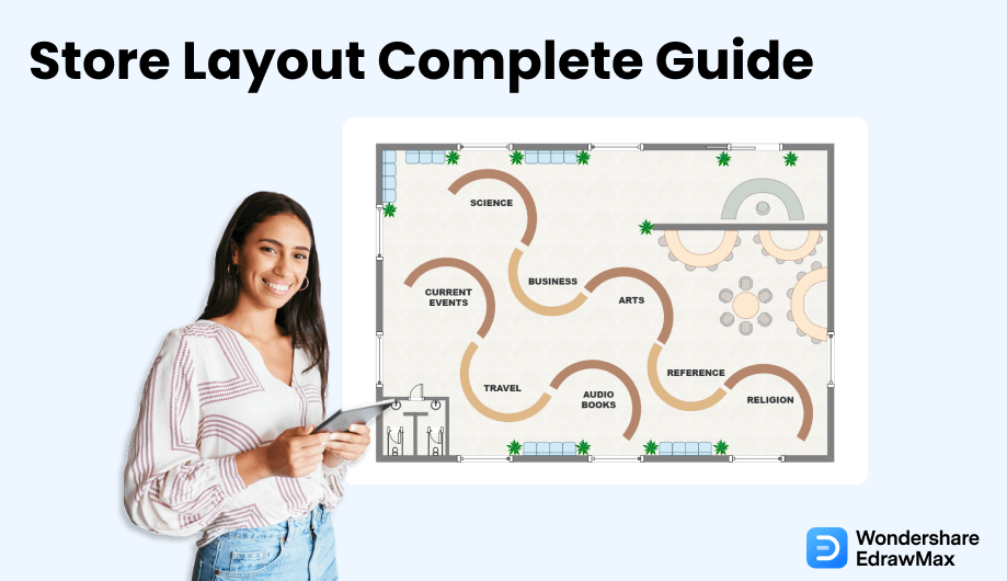
1. What is a Store Layout
Multiple marketing research surveys have shown that one of the most important criteria for customer satisfaction is the ease with which the customer finds his way in the store. As the name suggests, a store design or a store layout design is a term used to describe how retailers set up their stores or shops or display their products and fixtures in a store. Put simply, if your eCommerce store gives you an online presence, a physical store is necessary to increase the brand value. Here we will discuss in brief store layout and what all are included in creating a good store layout design.
How do you define a store layout? Well, anything that you see in a store is a part of a store design. From ceiling fans to the POP done on the ceiling to showcase your brand colors or logos, everything falls under a good store layout design. A retail store layout is the strategic use of space to bring customers and enhance their overall experience. It will not be wrong to say that most retailers use such store layout designs to influence customers' behavior by designing the store's flow, product placement, and ambiance. In simple words, a store layout is the design of a store's floor space and the placement of items within that store in such a way that it not only attracts the customers but ensures that the company's vision and message are easily conveyed.
A store layout is the design of a store's floor space and the placement of items within that store in such a way that it not only attracts the customers but ensures that the company's vision and message are easily conveyed.
2. What includes in a Store Layout
Just like any other building plan design, there are several key factors that are included in a store layout. Before we get down to some of the key components, you should understand that every store design is going to be different based on the brand or the product that they sell. For instance, the store layout of a sports shape will widely differ from a grocery store layout. So, some of the key components might differ, but the zest of all the major store layout designs is going to be the same.
Some of the most common important elements that are included in a store layout are:
- Fixtures
- Displays
- Colors
- Lighting
- Ceiling
- Flooring
In any store layout design, fixtures are used to display merchandise, help sell, and improve the overall customer experience.
In any retail store, the display is everything! What you display and how you display it is what matters the most. Displaying any product is also very important. For instance, in a bookstore, if the reader cannot access any book because of the unwanted bookshelf height, then you might lose a prospective customer. At the same time, if you have not displayed big mirrors in a footwear shop, then it would be difficult for the customers to see and understand how particular footwear looks on them.
It is stated in multiple types of research that colors play a huge role in a customer's psychology in deciding whether or not they are going to make a purchase. Bold colors are mostly used to highlight to reduce attention to open-girder ceilings. Colors like blue and green tend to calm people, while red or orange are considered extra-dingey shade colors.
In any store layout design, lighting is considered the key element that attracts customers. In good stores, you will see that they have used enough white lights to brighten up the space. In grocery store layouts, designers often use not-so-bright white lights. As you see, lighting is an integral part of the store's overall design.
Ceiling is yet another major component in any store layout design. In most sports stores, we have often seen designers hang several products on the ceiling or use a POP structure to increase the decorum while hiding away all the fixtures and HVAC elements, like air conditioning vents.
Suppose you are designing a clothing store layout, then you should understand that flooring is going to play a very important role here. You should divide the floor into multiple sections based on gender, types of clothes, offers, and more. At the same time, you should understand that there should be enough walking space for the customers where they can easily access all the clothes and then stand in the queue at the counter at the time of billing.
In addition to the above elements, some of the other key factors that are included in any store design are:
- The geographic location of the retail store (if it is going to be in a complex or a mall building).
- Size of the store
- What types of furniture one is going to be placed inside the store?
- Architecture's style and vision
Some of the most common important elements that are included in a store layout are: fixtures, displays, colors, lighting, ceiling, flooring.
key factors that are included in any store design are: the geographic location of the retail store, size of the store, type of furniture, architecture's style and vision.
3. The Types of Store Layout
As we discuss the store layout in detail, let us first explore the types of store layout. According to the University of Florida, there are different types of store layouts, like Forced Path Store Layout Design, Straight Store Layout Design, Angular Store Layout Design, Geometric Store Layout Design, Grid Store Layout Design, Loop Store Layout Design, Free-Flow Store Layout Design, and more.
- Forced Path Store Layout Design
- The major advantage of creating a forced-path store layout is that it gives the store owner direct control over customer flow.
- It is easier for the employees to guide the customer toward popular items.
- The most important drawback of a forced-path store design is that it is very time-consuming to walk in and out of the store. The customers who walk into such stores are forced to complete the entire path before they walk out of the store.
- Another major disadvantage of the forced-path store layout is that it might feel frustrating to those customers who know exactly what they want and still have to walk the entire place.
- Straight Store Layout Design
- Shoppers or prospective customers might get a chance to cover the entire store in order to get their desired product.
- Even if you have a smaller space in your area, creating a straight store layout design gives you plenty of space to display your products.
- Since all the products are properly displayed, there are chances that the customers might miss out on other products that they might buy.
- It might not be considered a good option in order to discover some new products.
- Angular Store Layout Design
- It provides a unique retail store design.
- Unlike other store layout designs, the angular one elevates the shopper's in-store experience.
- Since most of the products are displayed on vertical shelves, it provides less room for inventory to be displayed.
- Rounded displays consume too much of the inside space.
- Geometric Store Layout Design
- Such store layout designs produce a unique store design without costing too much.
- Choosing the right geometric shape adds to the brand identity.
- You will be fixed with the geometric shape that you have chosen, and it will cost you a lot if you need to make any modifications to such shapes in order to display more items.
- Some older generation people might find such designs a little too modern for their taste, but these are very subjective choices and depend from person to person.
- Grid Store Layout Design
- Such designs are great for displaying large numbers of a variety of products.
- Since most of the stores use such layout designs, it gives a sense of familiarity among the buyers.
- Such stores do not give uniqueness to the overall customer experience.
- In some rare cases, grid store layout designs can be confusing for customers if the product groupings are not correct.
- Loop Store Layout Design
- Since the store owners already know the path their customers are going to take, they can place the promotional items at places where they are most likely to be seen.
- It provides maximum product exposure for all customers.
- Customers might feel restricted in choosing the products that the store owner wants them to see.
- For some customers who prefer to walk out early, creating a loop store design might feel frustrating.
- Free-Flow Store Layout Design
- Since there is no fixed traffic pattern, every design is unique in its own way.
- Such retail store layouts produce an experiential retail space.
- It might be a little too confusing to those customers who have a very specific product in their minds.
- Such store layout designs often come with less space for displaying the hero products of any brand store.
A forced-path store layout design is one of the most traditional store layouts where the store owners guide the customer's path to whichever products need the most attention. When a customer walks around a predetermined path in a store, it increases their chances of buying more products.
Pros:
Cons:
Straight layout designs or spine layout designs create enough space for customers to utilize the store's interior space fully. Most store owners create such store designs to optimize the store walls and corner spaces to show off the products everywhere the customer looks.You will find such a straight store layout design in most department stores or food stores because it offers the customers the chance to see everything in the store or simply go to the aisle that has their required product segment.
Pros:
Cons:
As the name suggests, angular store layout designs rely on curved walls and corners that are beneficial for displaying products or merchandise in the corners. Such angular store layout designs are generally used by luxury stores because 100 percent of customers notice free-standing product displays. At the same time, angular store layout designs give a sense of higher quality products. If the store owner has enough space, it somehow gives the shoppers a unique perception.
Pros:
Cons:
As the name suggests, a geometric store layout design includes multiple geometric shapes, like squares, rectangles, ovals, circles, and more, to display the products or merchandise. Such store layout designs are perfect for using functionality with the creativity of the store, as they represent a bold statement about any brand's identity. In most cases, the brand uses certain artwork and music that resonates with the geometric shape to heighten the overall customer experience.
Pros:
Cons:
Grid store layout designs are one of the most traditional store designs. You will find such store designs in almost every grocery store, pharmacy, and convenience store because by creating a grid store layout, stores maximize product displays while minimizing any white or blank space. It should be noted here that grid store layout designs are beneficial in such cases where one has a large space. If you have a smaller space for the store, you should be careful because there are chances that your customers might feel crowded or cramped in the narrow aisles.
Pros:
Cons:
The loop store layout design is created to deliberately provide a sense of a closed-loop path that guides customers around the store and all the way to the checkout, which makes the overall customer experience efficient and easy. In between the store's entrance and the checkout, the loop design lets the customer walk past every piece of merchandise the store has to offer. Most designers or architects go with the loop store layout design by constructing the floor path in a standout color, lighting the loop to guide the customers in the right direction, and using a different floor material to mark the loop. In most cases, such loop store layout designs are encouraged because it rewards the customers with interesting visual displays.
Pros:
Cons:
The free-flow store layout design gives a sense of openness to the customers because it does not restrict the customer's flow inside the store. As the name suggests, a free-flow store layout design encourages all the customers to walk around the space freely without following any predefined traffic pattern. In a free-flow store layout design, there are no specific design rules or paths that the customers have to follow. Just for this reason, this type of store layout design is considered one of the best and most sophisticated designs for any up-and-rising store.
Pros:
Cons:
4. Why is the Store Layout So Important
Just like creating any kind of seating chart or seating plan is important to ensure that the guests are in the right place, creating a store layout serves another bigger purpose for any store. Following are some of the major importance of creating a store layout:
- When a store creates a store layout before creating the interior and exterior layout, it is able to understand which parts of its store (product, area, placement) are working correctly. Just by analyzing the traffic pattern, store owners can increase their product sales. If the store layout is not correct in the store's favor, then the store owner can easily make the appropriate changes.
- Another important purpose of creating a store layout is that it creates a smooth customer flow throughout the store, allowing them to choose the right products and even buy some of the additional items.
- If you have created a correct store layout design, you have somehow minimized the chances of shoplifters. When you develop a store design layout, you can take appropriate precautions that make it difficult for shoplifters to steal anything. One such activity is to work on the reflected ceiling plan that helps in installing CCTV or dome cameras.
- A good store layout can attract customers or make them skip your store! In most cases, new customers only visit the store if they find it appealing or attractive, and by creating a correct store layout design, you ensure that all of your target audience is satisfied with the design flow.
- Be able to understand which parts of its store (product, area, placement) are working correctly;
- Creates a smooth customer flow throughout the store;
- Minimized the chances of shoplifters;
- Traffic Flow: You must understand that every store should have a well-defined traffic flow. If your customers are feeling crumbled or crowded, then you have chosen the wrong store layout.
- Lighting: Lighting is yet another part of a good store layout. If your lighting is too bright or too dark and does not go with your products, then you should immediately consider replacing them with better alternatives.
- Space: Always ensure that you organize plenty of space in your retail store layout. A cramped-up space will keep your customers away from your store, as it makes them uncomfortable.
- Checkout Areas: Checkout areas or payment counters also play a vital role in making a good store layout. Over-cluttered exits are an impediment when it comes to the overall buying experience. Often it is seen that many customers have filled their carts with different products but have walked out without buying anything because of the cramped up checkout area.
- Always make a note of the floor plan and reflected ceiling plan before you start creating the store layout. You can use EdrawMax to work on floor plans and reflected ceiling plan designs.
- Always consider the size, volume, and type of products before you set out and design the store layout design.
- Always add additional storage units that help in keeping extra merchandise.
- Visual Merchandising Strategy
- Zone Merchandising Strategy
- Lighting Strategy
- Display Strategy
- Window Strategy
- The first thing to consider is to ensure that you have the correct windows display. If it is festival season, ensure that your mannequins are dressed accordingly. This way, your prospective customer will relate to the theme and will walk right inside the store.
- It is always a good practice to understand your target audience before creating the store design. If you are creating a store layout for sports accessories, then ensure you choose the related floor plan, lighting, ceiling, colors, and design type that resonates with your customers.
- You should not put everything on display, as you might lose the element of surprise. Put some of the best-selling products or discounted products in the last column or aisle, which will make your customer walk all the way to the end of the store. This way, there is a possibility that they might stumble upon some other products that they might buy.
- Always focus on lighting when you work on the design. We cannot emphasize this point enough, but bad lighting creates strains, affects visibility, and even makes most of the customers walk out of the store without buying anything.
- Store layout designs that you have created in EdrawMax are completely robust in nature.
- You can easily share and work on revisions using the in-built share option.
- With the help of 50,000 vector-enabled symbols, you can add as many components as you want to your store layout.
- Just by changing the background color or modifying the color of components, you can create a unique store layout design.
- Unlike other graphical tools, EdrawMax offers a free trial version where you can easily access the free templates and symbol library.
- This free store layout software lets you create over 280 types of different diagrams.
- EdrawMax comes with an online version from which you can easily collaborate with your remote team members.
- This free store layout software is a powerful tool that offers you to export your files in multiple formats and present them right from the dashboard.
- If you are a beginner, then you will find the template community useful. We have over 25 million registered users who publish their designs to inspire others.
5. What Makes a Good Store Layout
Now that you have understood the different types of store layout designs and why they are one of the most useful designs that you do for your store, let us see what actually makes a good store layout. Here, we will discuss some of the key components that you must consider when you design a new store or make certain changes to an existing store design.
It should be noted here that a good store layout is a very subjective topic, and it depends upon the business, demographic, resources, budget, and personal choice. For instance, a bookstore owner can either have large shelves to display the book, while another bookstore owner can simply stack the best-selling titles at the front of the counter. However, some of the most crucial components of every store design remain the same.
6. Store Layout Design Tips
6.1 Key Consideration
When you set out to create your store layout design, there are a couple of things that you need to consider, like:
6.2 Design Strategies
As we see in every day's shopping spree that a store's design influences our design in either buying from that store or choose another store. Some of the most common store layout designs that you can follow are:
It would not be wrong to say that a visual merchandising strategy holds power to influence the overall experience of any buyer. In the current retail world, visual merchandising is considered the single most important factor in creating a strong customer base.
A zone merchandising strategy merges visual merchandising with your store's layout. One can create multiple zones by using signages or walls, which can offer a better navigation area to all the customers.
If you have not chosen the lights as per the brand or products, then you are creating an uncomfortable environment for your buyers. When done right, lighting strategy can help structure and even influence the customer's mood while shopping.
Displays set the stage for your prospective buyer's overall experience when they navigate throughout the store. Some store owners prefer to have movable units, while some add fixed items, like racks, tables, or gondolas, to improve the customer's shopping experience.
Believe it or not but windows of any store serve as a welcoming zone to all the customers. Displaying your best-selling products, placing the mannequins, or even adding props can increase the footfall of your retail store.
6.3 Important Principles of Retail Store Design
How are you going to differentiate your store design from other stores that sell a similar line of products? What are some of the most common untapped areas that you should consider which will ensure that your store design will stand out from the crowd? Here we are going to discuss some of the important retail store principles that bring back lost customers.
7. How to Draw a Store Layout in EdrawMax
As you must have seen and understood by now, designing a store layout takes time and effort. However, if you design it on paper or such software that is too clumsy or expensive, you will end up either not going ahead with your store layout or spending way too much on your architect to come up with a store layout for you.
Instead of wasting time drawing a store layout on paper, you should look for a way to design a store layout easily. EdrawMax is well equipped to design a store layout. There are only a couple of steps that you need to follow in order to easily create it, like:
Step1 Create an outline
The foremost step in creating a store layout is to go to the store location physically and make a survey of the store. Check out the size, height, and important areas. Now that you have noted down such spaces, you can start creating the outline in EdrawMax. For this, you need to download the 2D store layout software from the official website and register using your personal or professional email address.
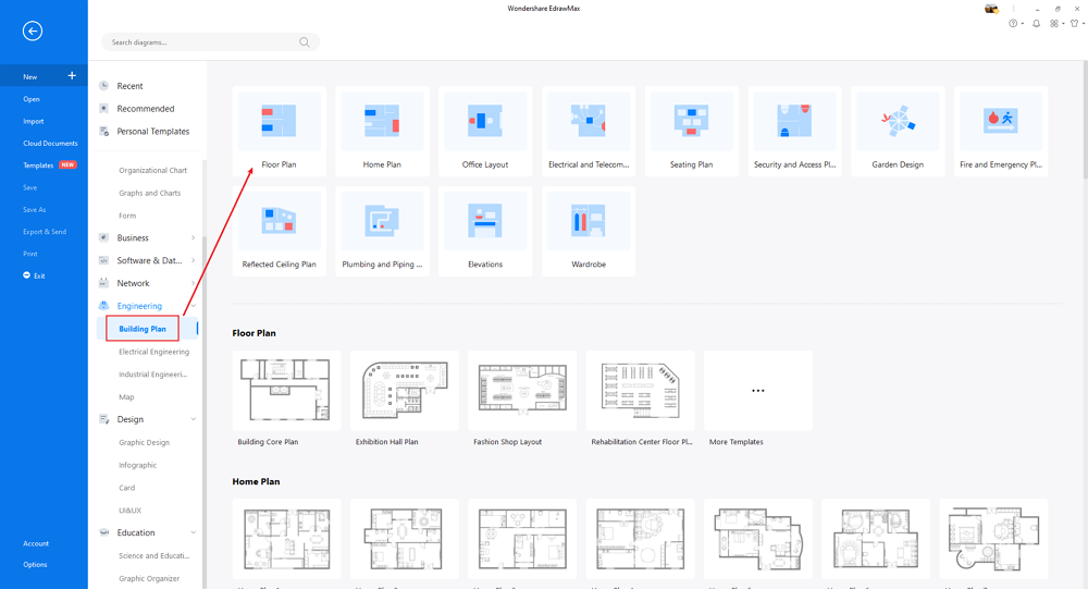
Step2 Open EdrawMax
Once logged in, you can head to the diagramming section. The tool offers two ways of creating the store layout. The first method is where you choose built-in templates, and the second one is where you create every aspect of the store layout from scratch.

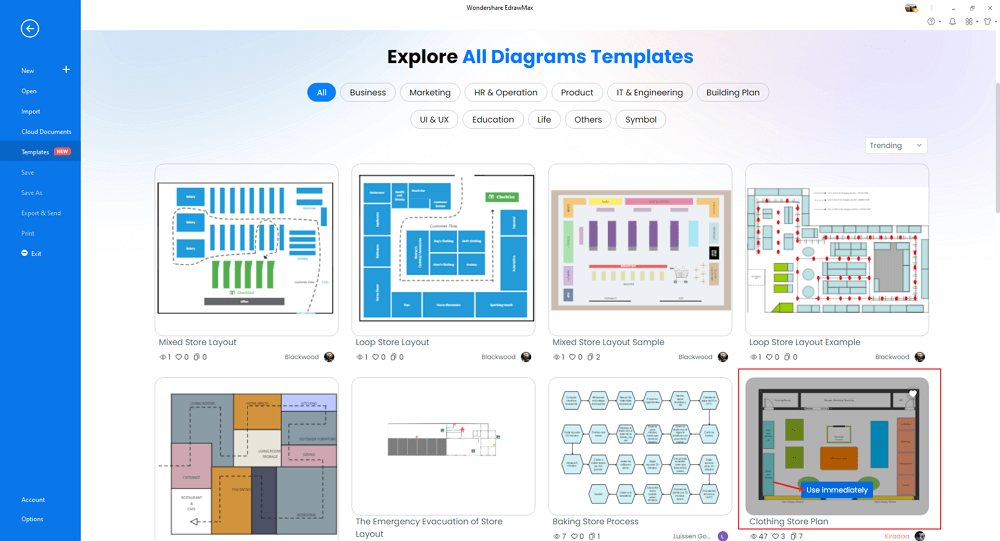
Step3 Select Template/Create From Scratch
If you have decided to go with the easiest part, then click on Templates and search for store layout in the template community. Here you will find several user-generated store design layouts. Choose any of these designs and start customizing them as per requirement. If you decide to go ahead with the second method, then come to the EdrawMax dashboard, and click on Building plan, followed by clicking on '+.' The system will automatically open the blank canvas where you get to create the retail store layout design from scratch.
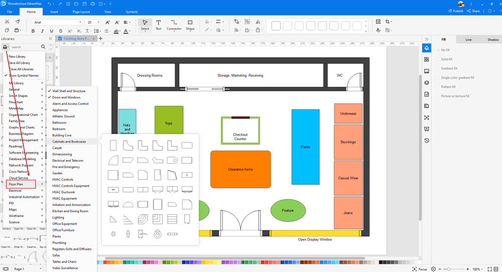
Step4 Select Symbols/Components
EdrawMax comes with over 50,000 vector-enabled symbols. Once your outline is ready and you have created multiple walls and windows, you can start adding different components based on your store's business. If you sell shoes, then find shoes in the symbol library and place them in the required place. If you are designing the store layout for a bookstore, then add bookshelves and add some books to the design.
Step5 Export/Share/Present
Once you are satisfied with the store layout design, you can export it into multiple file formats, like JPEG, PNG, PDF, and more. You can further share and present your store layout to multiple social media platforms, like Facebook, Twitter, LinkedIn, and more.

Basically, it is simple to create a store layout in EdrawMax, just grab a template and keep customizing, drag and drop professinal store layout symbols to make your plan better. If you are still confusing about how to make a store design or store layout in EdrawMax, just check this store layout guide, or check the video below. Or you can find more tutorial videos from our Youtube.
8. Advantages of using EdrawMax
EdrawMax offers two amazing ways to draw a store layout. The first one is where you can create a store layout using the free templates, and another way is where you design the retail store layout from scratch. Some other important advantages of using EdrawMax over general ways of drawing the store layout are:
9. The Store Layout Examples & Templates
There are 3 examples of store layouts that you can refer or use immediately. Just click the image to download EdrawMax, and download the templates accordingly. Then double click to open the templates and customize as your prefer. Or open the templates from EdrawMax Online , and duplicate the templates. Click this store layout examples to get more inspirations.
Example 1: Convenience Store Layout
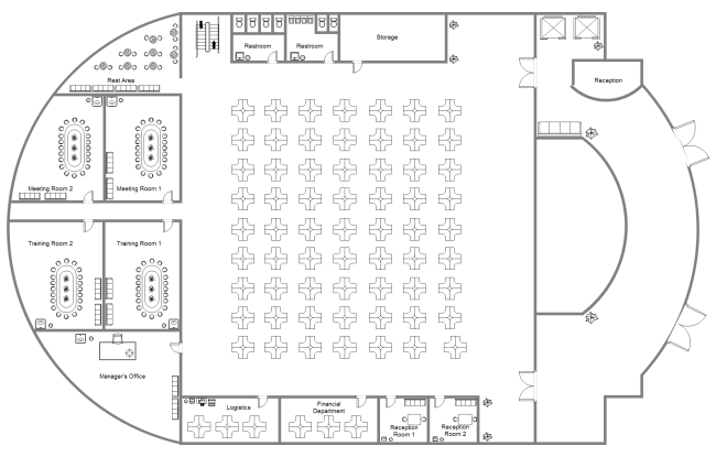
Following is a convenience store layout where we see multiple aisles holding best-selling products. At the same time, we have properly used the corner space to add different items in the L-shape. EdrawMax offers amazing templates that easily let you create and share robust store layout designs with you. Once you have customized these templates, you can easily go ahead and share them with your team using the in-built share option.
Example 2: Auto Repair Shop Layout
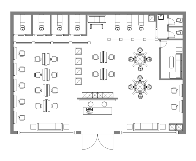
An auto repair shop is one of those places that need extra open space where one can directly drive their vehicles. As illustrated in the following auto-repair shop layout example, we have created a huge partition in the repair shop. On one side, customers can drive in their vehicles and have seating arrangements. On the other side, we have created a waiting area where the customers can browse through the latest product that they can fit into their vehicles. EdrawMax is the perfect tool to work on such store layout designs. From giving you access to such well-built templates to letting you customize them to the fullest, EdrawMax is an all-in-one tool that helps in creating store layouts as per your requirements.
Example 3: Boutique Floor Plan
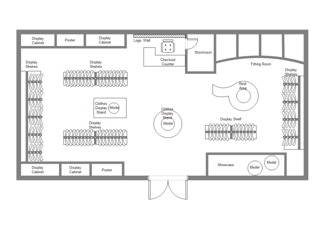
Following is a boutique floor plan that has several geometric shapes, like circular, rectangle, square, and more, to showcase the latest products. It should be noted here that such templates can easily be customized in EdrawMax. With the help of this 2D store layout software, you can place all the components as shown in this design. In the following boutique floor plan, we have also fully utilized the corner space by adding different items.
Example 4: Bookstore Layout
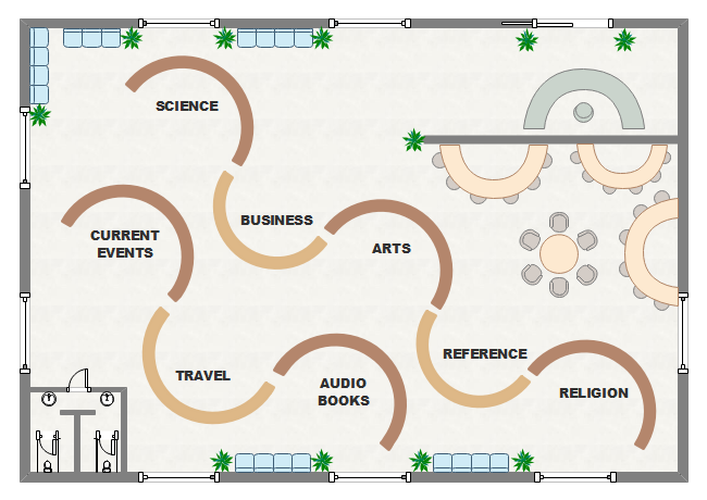
Following is a bookstore layout where we have multiple long shelves to display the books. At the same time, we have added the best-selling books at the front of the bookstore so all the prospective buyers can have a glance at them. As you saw here, such store layout design inspires prospective students so they can also go ahead and create their unique retail store layout designs. By using the amazing features offered by EdrawMax, you can create such store layout designs in just a couple of minutes.
10. Free Store Layout Software
As you saw from the above-mentioned examples, it is extremely easy to create and share some amazing-looking store designs using EdrawMax. When you download and install this free store layout software, you will realize that this offline 2D tool has so much to offer that it somehow beats the need to use complex and costly tools. Some of the great features of EdrawMax are:
key Features of EdrawMax:
11. Final Thoughts
As you understood in this article, a well-designed store layout proves advantageous to everyone who is involved in the company -- from the owner to the customer. A good store layout design results in improved efficiency, reduction in manufacturing cycle time, cost reduction, and also increased inventory turnover, leading to improved customer satisfaction. Some of the other important benefits of having a store layout also include the fact that it ensures the trust value in your customer, ultimately increasing the loyalty, and proves to the market and your competitors that as a business owner, you are here to stay and win the market.
Creating a good store layout can be a challenging part, as most of us do not know where to begin the design process. You can either go ahead and hire an architect or an interior designer who is going to charge a handsome amount or you can download EdrawMax and create a free store layout design that resonates with your brand and vision. As you saw in this guide, designing a store layout with free templates and symbols is as easy as a drawing can get! Head to the templates section and duplicate any of the store layout designs, and save much money and overdue processes in creating a store layout for your personal or professional usage. So, what are you waiting for? Download this 2D store layout software for free and start making some beautifully crafted retail store designs with your clients or builders.
Floor Plan Complete Guide
Check this complete guide to know everything about floor plan, like floor plan types, floor plan symbols, and how to make a floor plan.
You May Also Like
Building Plan Complete Guide
Knowledge
Evacuation Plan Complete Guide
Knowledge
Blueprint Complete Guide
Knowledge
Security Access Plan Complete Guide
Knowledge
Reflected Ceiling Plan Complete Guide
Knowledge
Plumbing & Piping Plan Complete Guide
Knowledge

