We often see banners on the roadside or in markets advertising different things, be it products or services. However, with the transition of physical things to the virtual realm, banners have also become online. These are called web banners. Web Banners have several sizes and styles that one can choose from. They are also not just bound to your desktops and laptops, but they are also essential in mobile devices and applications. This article will help you in identifying the different sizes, styles and name of the banners that you can use.
Part 1: Web Banner Sizes
According to the Interactive Advertising Bureau, there are certain guidelines that have been put forth, which not to be adhered to when making a web banner. There are at least 18 important Standard Banner Sizes that you can choose from.
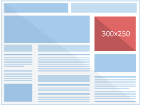
1) Medium Rectangle
Size (Px): 150 x 250
Example:
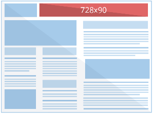
2) Leaderboard Banner
Size (Px): 728 x 90
Example:
3) Wide Skyscraper
Size (Px): 160 x 600
Example:

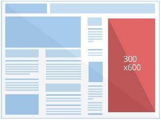
4) Half Page
Size (Px): 300 x 600
Example:
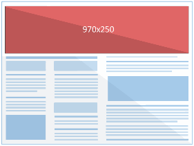
5) Billboard
Size (Px): 970 x 250
Example:
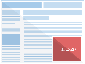
6) Large Rectangle
Size (Px): 336 x 280
Example:
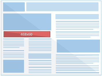
7) Banner
Size (Px): 468 x 60
Example:
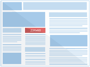
8) Half Banner
Size (Px): 234 x 60
Example:
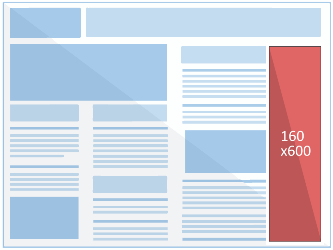
9) Wide Skyscraper
Size (Px): 160 x 600
Example:
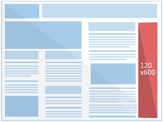
10) Skyscraper
Size (Px): 120 x 600
Example:
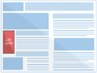
11) Vertical Banner
Size (Px): 120 x 240
Example:
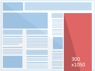
12) Portrait
Size (Px): 300 x 1050
Example:
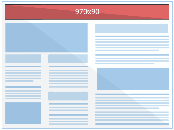
13) Large Leaderboard
Size (Px): 970 x 90
Example:
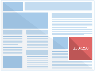
14) Square
Size (Px): 250 x 250
Example:
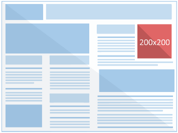
15) Small Square
Size (Px): 200 x 200
Example:
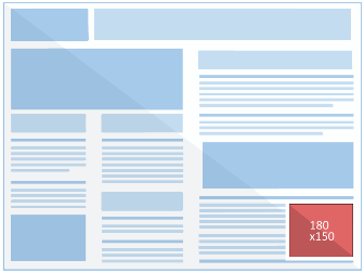
16) Small Rectangle
Size (Px): 180 x 150
Example:
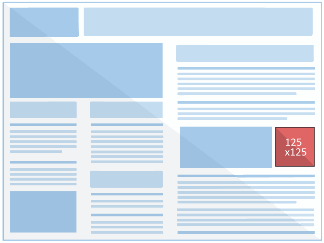
17) Button
Size (Px): 125 x 125
Example:
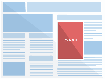
18) Triple Widescreen
Size (Px): 250 x 360
Example:
These are the most used and important Banners that you can generally choose from when finding the perfect size for your ads.
Part 2: Mobile Banner Sizes
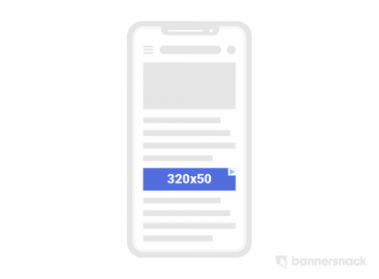
1) Mobile Leaderboard
Size (Px): 320 x 50
Example:
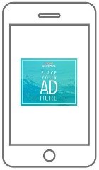
2) Mobile Full page flex
Size (Px): 320 x 320
Example:
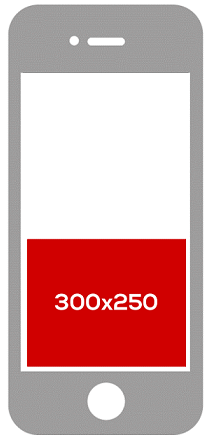
3) Medium Rectangle
Size (Px): 300 x 250
Example:
4) Small Square
Size (Px): 300 x 600
Example:
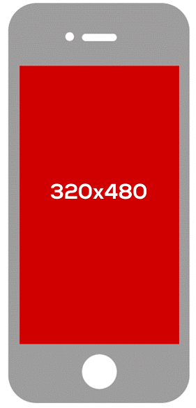
5) Full Page Banner
Size (Px): 350 x 480
Example:
6) Square
Size (Px): 250 x 250
Example:
As observed, the banner sizes for a mobile phone are not in a lot of quantity as compared to the ones on the web. Yet, all of these are equally effective and due to the accessibility factor of a mobile phone, they increase viewership drastically.
Part 3: What Banner Size is best for you
The main purpose of the banner is to display your Ad on different sites and applications. The best course of action would be to choose a banner size that is most popular, widely used and perfect for all types of gadgets. We need to realize that in present times, most of the users have shifted to mobile phones and use it as a source of information. To adhere to these changing times, it is necessary that relevant banner sizes are considered.
1) Medium Rectangle 150 x 250 (Perfect for text-based and image-based Ads)
The medium rectangle is the most used banner size. It is also known as the ‘Incline Rectangle’ This popularity speaks about its importance in the Advertisement world. About 40% of the entire global inventory is covered by this banner. This size is perfect for both cellular and other gadgets such as desktops and laptops. The size is noticeable in every gadget out there. If your aim is to target a large audience, this banner size is perfect. It can easily rest on the user’s laptop webpage, without disrupting their work. It serves its purpose even better on cellular devices. Fitting the exact dimensions of webpages on cellular devices, it can serve as a break between lengthy paragraphs and content as well. Since it mostly comes right in the middle, it will always cross the eyesight of the user, leaving no room for the chance that it is being missed by the eyes of the audience.
2) Mobile Leaderboard 320 x 50 (Perfect for text-based Ads)
The mobile leaderboard is the most used and common banner to accommodate phone users. About 12% of the entire global inventory consists of this banner size. As shown above, this size perfectly fits the dimensions of a cellular device. Moreover, as it resides at the bottom of the page or application, the chances of it annoying the user are very low. Plus, every time the user scrolls, they are bound to look at the banner present right above their home button.
3) Leaderboard Banner 728 x 90 (Perfect for more text-based Ads)
The leaderboard banner belongs to 25% of the entire global inventory being used. This percentage speaks volumes about how much it is preferred. The leaderboard banner is a horizontal banner that visible at the top of a webpage. This increases the viewership of the Ad as well. The leaderboard banner along with the mobile leaderboard can be used in order to increase viewership. This banner is also preferred because it is displayed at the top. This serves as an advantage even if a user accesses a site accidently, their eyes will fall on the Ad, while Ads that are placed at the bottom will definitely will be missed.
4) Wide Skyscraper 160 x 600 (Perfect for Image-based Ads)
The Wide Skyscraper, also known as the standing banner, is a vertical banner usually found on the right side of the webpage right next to the scroll cursor. The wide skyscraper is the widely used vertical banner as it constitutes 12% of the global inventory. Its placement makes it ideal for Ads that contain bigger images, gifs, snippets and small video graphics.
EdrawMax
All-in-One Diagram Software
- Superior file compatibility: Import and export drawings to various file formats, such as Visio
- Cross-platform supported (Windows, Mac, Linux, Web, Android, iOS)
Part 4: Design Tips
1) Keep it Simple:
The main idea behind this is to prevent Ad stuffing. Avoid filling your Ad space with unnecessary information and images. Try to keep it as relevant and as simple it can be. Mostly simple Ads are the most effective ones as they captivate the audience with the relevant info. Moreover, users like things to be direct.
2) The use of Images:
Images are a great way to capture the attention of users. They are eye-catching and help in delivering messages more effectively too. Illustration and pictures both can be used, based on the type of company and slogan your company might have. For example, a telecommunication company will most likely use pictures of their mobile phones. While a company such as red bull can make use of illustrations, even Ads for games are mostly illustrated. The better the images used, the chances of users pressing the CTA button increases.
3) CTA Buttons
The CTA or Call to Action guides users to what they have to do next once they have seen the Ad. It prompts a certain action that the user can take. These prompts are usually right below the text of the Ad, the illustration or on the right corner. The CTA Buttons can easily be recognized as they compose of texts such as Shop now, sign up, Learn more, Play now and Book now. They are an important component to the Web Banners, just as regular banners have numbers or contact details, pressing the CTA button will redirect you to the site of your product. Making these buttons stand out is necessary so that users are compelled towards pressing or tapping on them. The right color scheme can help a lot for the users to be psychologically pulled towards the CTA button.
4) Heading and Subheading
Remember that you need to have a catchy headline but also a compact one. Users prefer something that is short but can intrigue their interest. While the subheading should build upon what the heading is talking or pointing towards. Do keep in mind that it is not advisable to cram your Ad space with text, so keep the subheading concise too and if information is necessary, a CTA button (Read More) should be placed.
5) Background and Clarity
Choosing the perfect color scheme for your background is also necessary. The colors should be as such that they go well with the text, pictures and CTA button present in the Ad space. The combination of all these components should be in complete clarity. Clarity should also exist in the text used to deliver the main theme of the Ad.
Part 5: Examples with reference to famous sites
1) YouTube
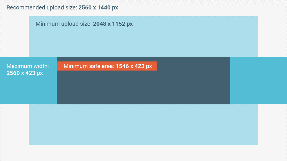
YouTube is one of the most used sites and one that heavily relies on revenue generated by Ads. They have set their own guidelines in respect to their site. The banner guidelines are as follows
- Recommended Banner Size: 2,560 x 1,440 pixels
- Minimum image dimensions: 2,048 x 1,152 pixels
- Minimum image safe area for text and logos: 1,546 x 423 pixels
- Maximum image width: 2,560 x 423 pixels
- File size limit: 6MB
Example
2) Twitter
Twitter does not really allow remote Ads, so to run a successful Ad campaign you have to adhere to certain rules of the site after making an account. You can post your on several places across twitter. The dimensions of those places are as follows:
Twitter Header Size: 1500 x 1500
The Header is usually the top most part that is visible of your profile, the perfect spot to place an Ad.

Summary Card: 120 x 120
This space can be utilized to market your product and provide the relevant link to it.
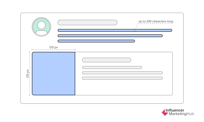
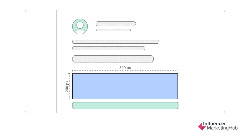
Image Lead Card: 800 x 200
This can be used to place CTA buttons for your Ad and also to display and Ad that has more text in it.
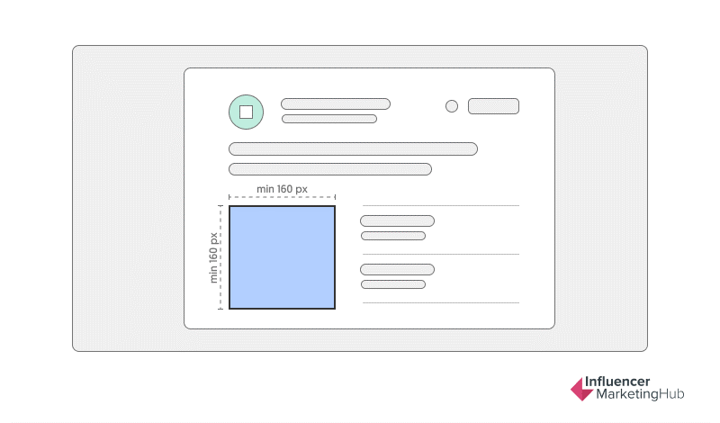
Product Card: 160 x 160
These cards can be used by individuals to market their product by using a 160 x 160-pixel image and adding a little description pertaining to the product.
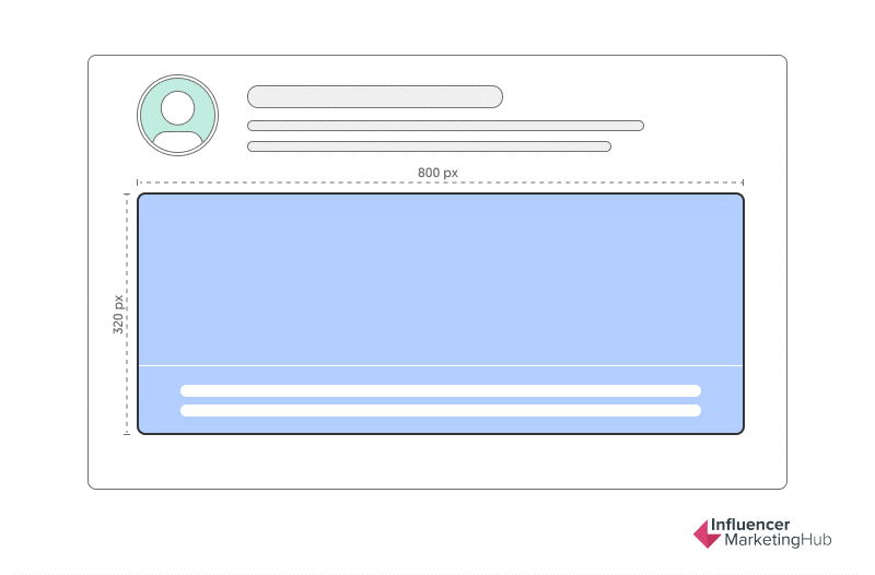
Website Cards: 800 x 320
Twitter also allows a websits card, a banner that you can use to advertise your website, clicking on this card will direct viewers to your website.
3) Twitch
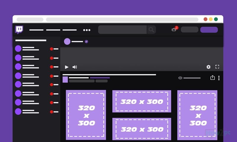
Twitch Feed Image Ads: 320 x 300
The twitch feed supports 320 x 300 pixel ads, both in vertical and horizontal dimensions.
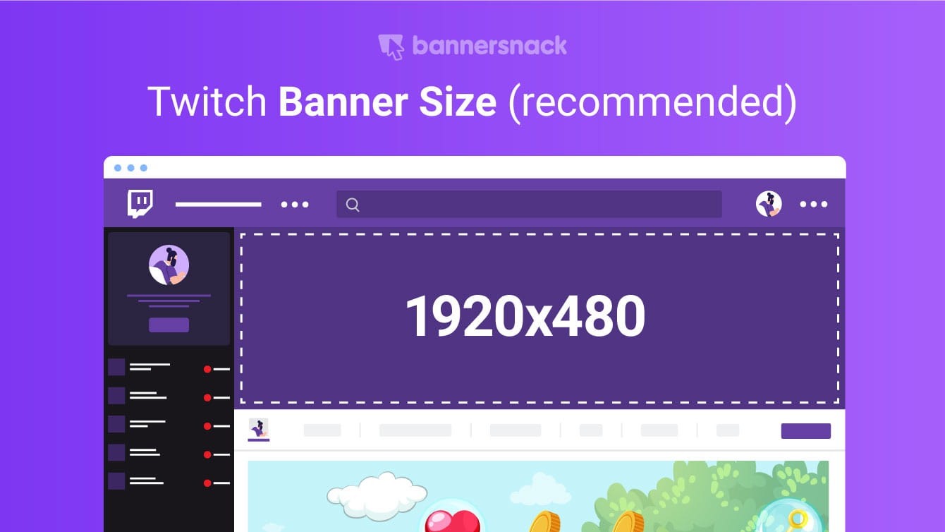
Twitch Header Ads: 1920 x 480
4) Facebook
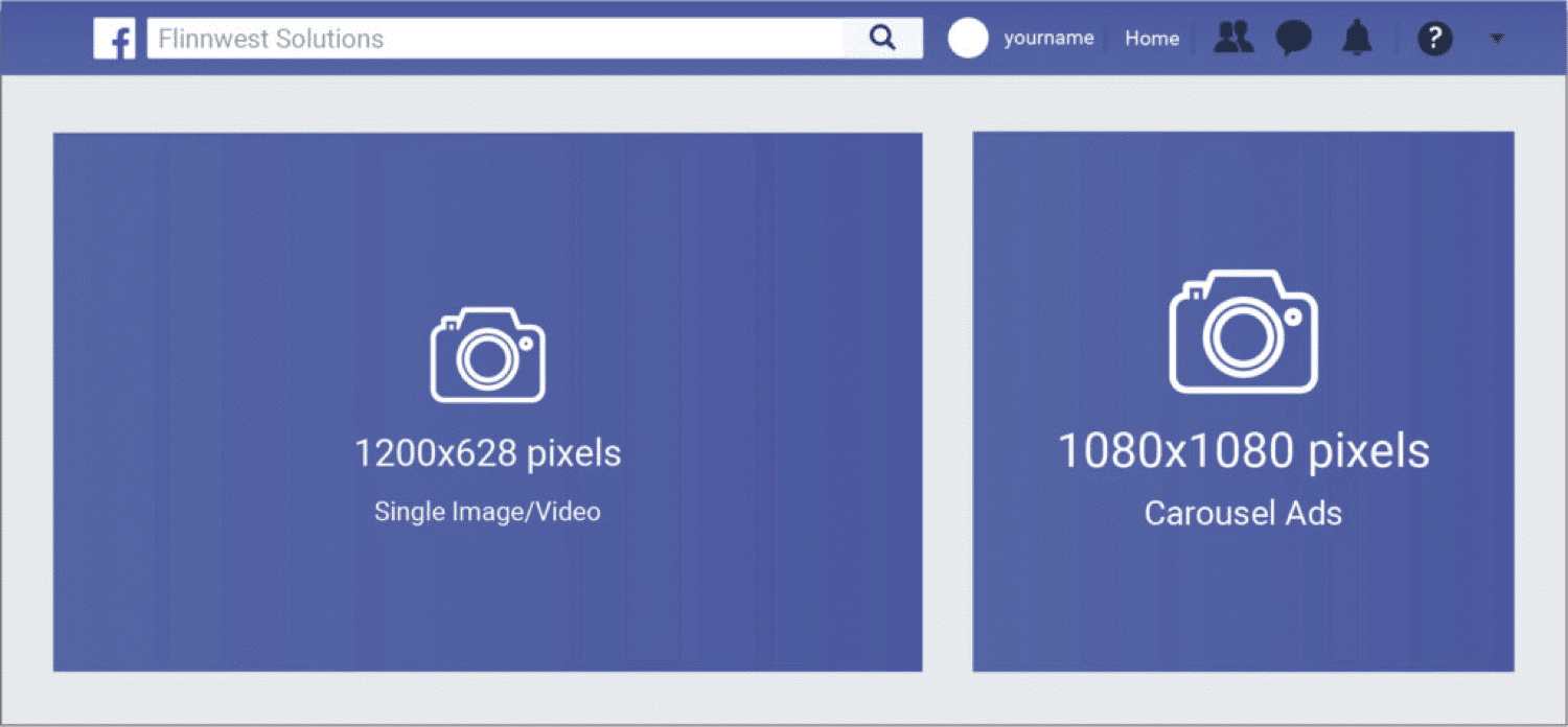
- Facebook Feed Image Ads: 1200 x 628
- Facebook Feed Video Ads: 600 x 315 or 600 x 600
- Facebook Carousel Ads: 1080 x 1080
- Facebook Right Column Ads: 1200 x 628
- Facebook Marketplace Ads: 1200 x 628
- Facebook Instant Articles Ads: 1200 x 628
- Facebook Stories Ads: 1080 x 1920
- Facebook Collection Ads: 600 x 600
5) Instagram
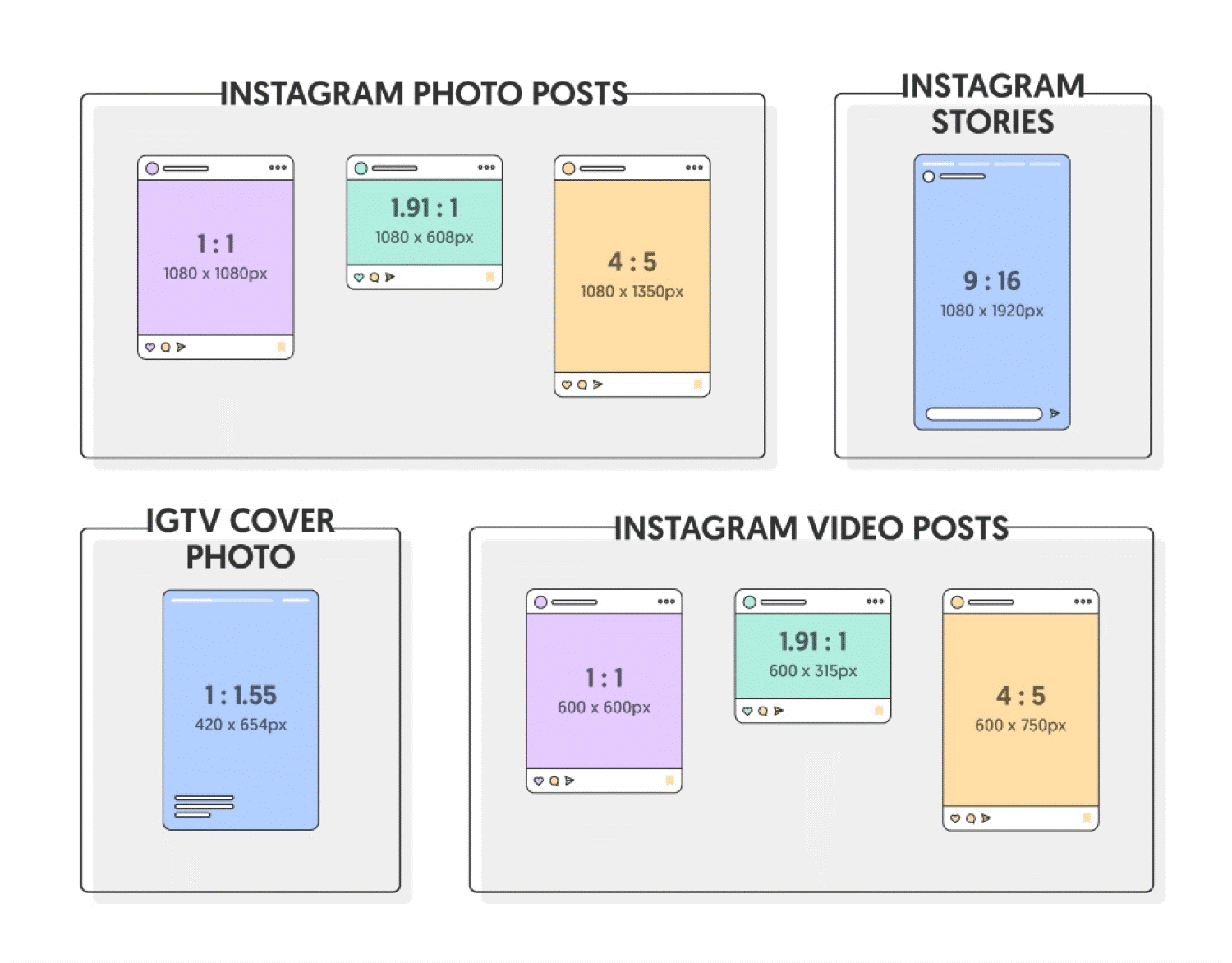
- Instagram Single Image Ads: 400 x 500
- Instagram Video Ads: 400×500, max
- Instagram Carousel Ads: 1080 x 1080
- Instagram Stories Carousel Ads: 1080×1920
- Instagram Slideshow Ads: 600 x 600 pixels, max. 1080 x 1080
- Instagram Stories Image Ads: 1080 x 1920
- Instagram Stories Video Ads: 1080 x 1920
6) Pinterest
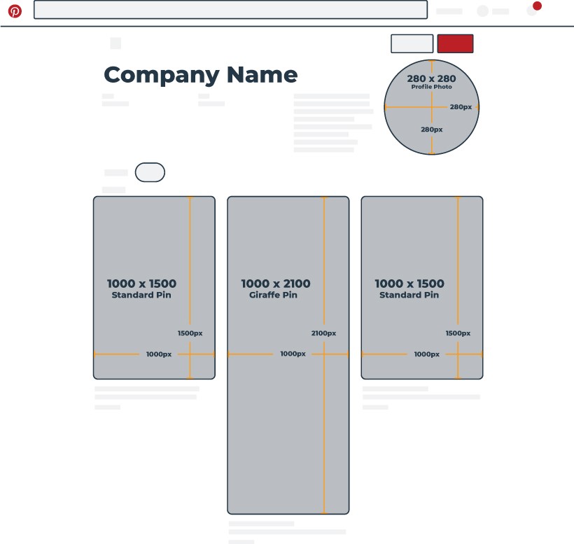
- Pinterest Profile Ads Image: 280 x 280
- Pinterest Standard Pin Ads: 1000 x 1500
- Pinterest Giraffe Pin Ads: 1000 x 2100
Part 6: Conclusion
Understanding the necessity of all the details regarding Banner sizes and then using it to make ads that perform well, definitely takes time. These standard sizes are essential for increasing the reach of your ads. Like the medium rectangle is preferably the best option to choose from and then the mobile leaderboard, insuring increased viewership and reach. Hopefully, this article will guide you to the creation of your own dynamic and interactive Web Banner.


