What is a Wireframe
- Part 1: What Is a Wireframe?
- Part 2: Advantages and Disadvantage of Wireframes
- Part 3: Why do Wireframes Look the Way They Do?
- Part 4: Types of Wireframes
- Part 5: Tips to Consider When Designing a Wireframe
- Part 6: Difference between Wireframes, Mockups and Prototypes
- Part 7: Common Symbols
- Part 8: Example of Wireframe
Part 1: What Is a Wireframe?
Sometimes, understanding technical terms tend to be a little confusing. But worry not! If you're trying to figure out what wireframes are and how they are useful, we got your back! This article will tell you all that you need to know about wireframes.
Wireframes are a type of rough sketch of a user interface. Website/software designers and developers use them to give a tangible idea of what the overall functional layout will look like. It does not focus on the look of the product rather it focuses on its functionality. It is a way of communicating between designers and programmers to get timely feedback.
Wireframes initially were not related to web design rather were used in Computer-Aided Designs to show 3D objects. However, this term was later on used in the web design industry. No one is sure who first coined the term, but it is believed that several people started using it simultaneously.
Part 2: Advantages and Disadvantage of Wireframes
Advantages of Wireframes
- Visual Display of Site Architecture
- Assess Useability Objectively
- Cost-friendly and Timesaving
- Ease of Update
Wireframes are like a blueprint of a website or software and give a visual representation of the structure of the product. It ensures that the developers, designers, and clients are on the same page. The visuals help in clarifying the features and what the clients want the final product to look like.
Since wireframes do not focus on the design such as colors, font types, quality of content, etc., therefore it helps assess the useability objectively. The developers think it better to address the useability and design one at a time rather than side by side.
The best part about wireframes is that they are extremely easy to edit and make. It takes only a few minutes to sketch a rough wireframe or make changes to an already designed sketch. This reduces the cost and time consumption significantly.
Wireframes ensure that in case of change in the function of the site or in case of an update, the site does not have to change significantly. Thus, making wireframes can help you assess the effects of updates and you can find ways to accommodate them.
Disadvantages of Wireframes
- Difficulty to Understand by Client
- Lacks Creativity
- Better Alternatives
Most clients are more interested in the look of the site or software rather than the functionality. So, they often tend to point out the roughness of the wireframes. Furthermore, many clients believe that this is an additional step that is not important and should be skipped.
Once the wireframe has been finalized, there is little room left for the creative element because the structure has been set. The designer does not have a lot of space to show his creative potential in the final product.
Wireframes are no longer as time-saving as they used to be. This is because better alternatives have come forth. Previously, Adobe Photoshop was used for UI designs but now other tools such as InVision Studio, EdrawMax, Figma, etc. have paced up the process. High-fidelity mockups can be created very easily, making wireframes unnecessary.
Part 3: Why do Wireframes Look the Way They Do?
Wireframes are a type of blueprint of a house. It focuses more on the structure rather than the decorations. They are used to gauge the user’s experience and how it can be made more user-friendly. Their purpose is not to focus on the look rather to objectively assess the useability, navigation placement, conversion paths, and feature placements.
Moreover, you know it is not the final look because of its roughness which also makes it easier for you to discuss and criticize it without holding back.
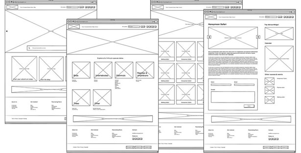
Furthermore, they are simple black and white lines showing the overall structure and placement of content much like a rough sketch so you can be sure that the code has not been written yet and the edits can be made easily.
Part 4: Types of Wireframes
1. Low Fidelity Wireframes:
These are very basic wireframes much like a rough sketch. They use abstract images to show which space will be used for what purpose. They are relatively quick to make and best for exploring new ideas. They can be made on paper or a whiteboard.
2. Mid Fidelity Wireframes:
These wireframes use actual text, placement of images, and the navigation structure (how a user will move through the site). These are great for sharing at a presentation to give people (clients or team members) a basic understanding of what is going on. They usually require some sort of software.
3. High Fidelity Wireframes:
These are much more detailed, annotated wireframes and include information about different items available on the page such as dimensions, behaviors, or actions related to interactive content. They are most suitable for documentation. Furthermore, they are the best for handing over to the development team who needs to know every detail of the design. Proper software is required to create high-fidelity wireframes.
Part 5: Tips to Consider When Designing a Wireframe
Tip #1: Start with a low-fidelity wireframe.
When starting a project, it is best to start with a low-fidelity wireframe. It is super easy to change and you can do that in a few minutes. Plus, you can get an idea of what the client wants without having to spend a lot of resources on the coding or designing process.
Tip #2: Explore different ideas.
Wireframes are the best for exploring different ideas. You can experiment with wildly different navigation styles and layouts without any serious consequences. Explore your creative potential by playing around with different ideas.
Tip #3: Keep the coding cost in mind.
When designing a wireframe, make sure you keep in mind the budget and period of the project. Use your creative potential but also stay within the constraints. You do not want to disappoint the client.
EdrawMax
All-in-One Diagram Software
- Superior file compatibility: Import and export drawings to various file formats, such as Visio
- Cross-platform supported (Windows, Mac, Linux, Web, Android, iOS)
Learn How to Create a Wireframe
Part 6: Difference between Wireframes, Mockups and Prototypes
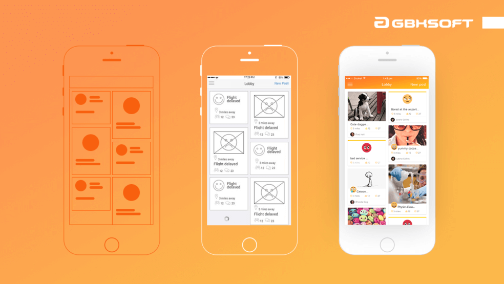
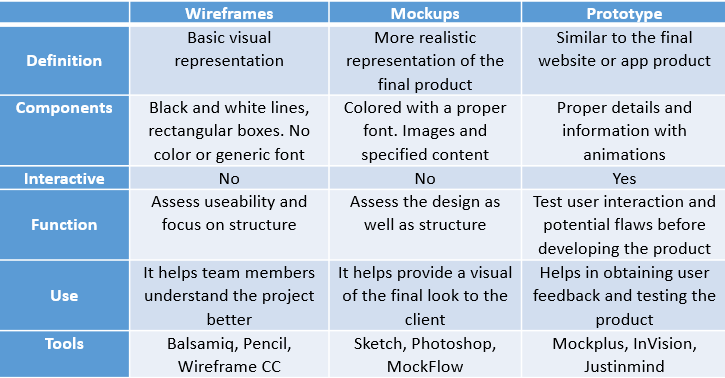
Wireframes, mockups, and prototypes are three terms that you often hear when talking about web designs. There tends to be some confusion regarding these terms, but we have explained their difference here as concisely as possible.
Part 7: Common Symbols of Wireframes
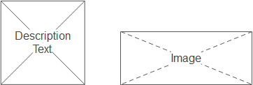
When wireframing, there are certain symbols that you will see everywhere. In case you are unaware of the meaning of those symbols, we will list a few of them here. The symbols used below belong to the EdrawMax software that provides users many built-in symbols for wireframing.




Part 8: Example of Wireframe
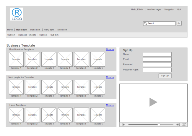
EdrawMax is a one of the software that can be used for wireframing. It provides numerous templates for different designs. Here is an example of one.
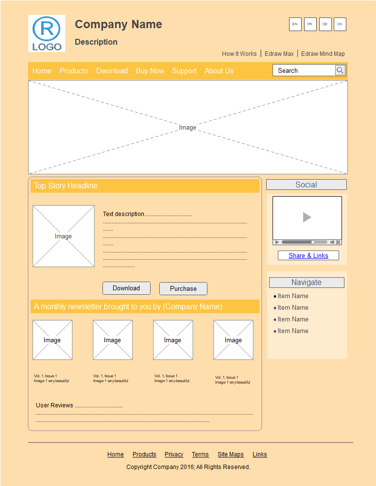
If you want to design a wireframe model for a website, EdrawMax has a built-in template that is the Website Design Wireframe. This template has all the necessary components (such as a logo, search bar, body content, headings, navigation systems) required for a website design. You can make quick adjustments within the template without having to start from scratch. It will save you a lot of time and hassle.
Customize the template and you are good to go!
Now that you have all the basic info about wireframing, get cracking!
