Bubble Chart
Know it All about Bubble Chart
Also known as the bubble graph, bubble charts are an extension of the scatter plot and proportional area chart. They are a popular multivariate data graph drawn on a 2-D scale but can represent the 3-D values. Like a scatter plot, these graphs use the Cartesian coordinate system to represent the values.
However, bubble charts have bubbles instead of dots for representing the values. To represent a data series, the size and location of the bubbles is altered. In some cases, color may be changed to represent the fourth value. Due to this application, these charts are popular in engineering, finance, medicine, economics, etc.
Bubble charts are useful graphs that are a popular choice for representing multivariate data. However, this chart has its shortcomings too. Let's see both of them briefly.
With a list of advantages on its profile, Bubble charts are a handy graphical tool used in many cases. Let's have a look at some of these scenarios.
Bubble Charts are dynamic and the most versatile kind of charts to exist. They further differentiate into different types. Let's check them out.
1. Labeled Bubble Charts
These are simple charts with few data plots. The only unusual thing is that every individual bubble is labeled. This helps in clarifying the name and makes it easier to refer to a specific bubble on the chart. However, the data in the labeled charts are kept limited; otherwise, it would get cluttered and incomprehensible.
2. Numeric Color Variable Bubble Charts
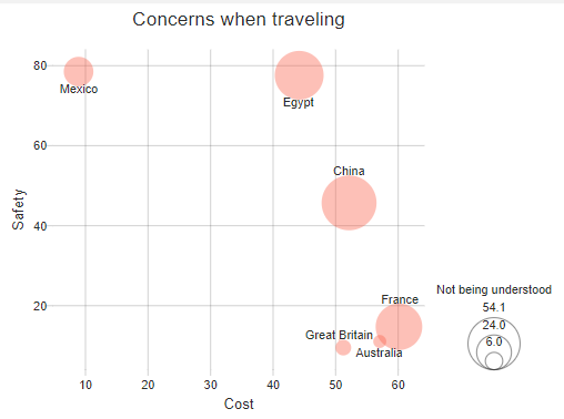
This is also a simple and minimalist chart where numbers are encoded with colors. For instance, the example below illustrates a chart showing concern about several countries' food. Some bubbles are colored grey, while the others are colored light blue.
The areas with a darker shade represent a higher intensity of concern, whereas the light blue regions indicate the absence of concern. This is how you can assign colors to the bubble and illustrate their intensity without mentioning any numbers.

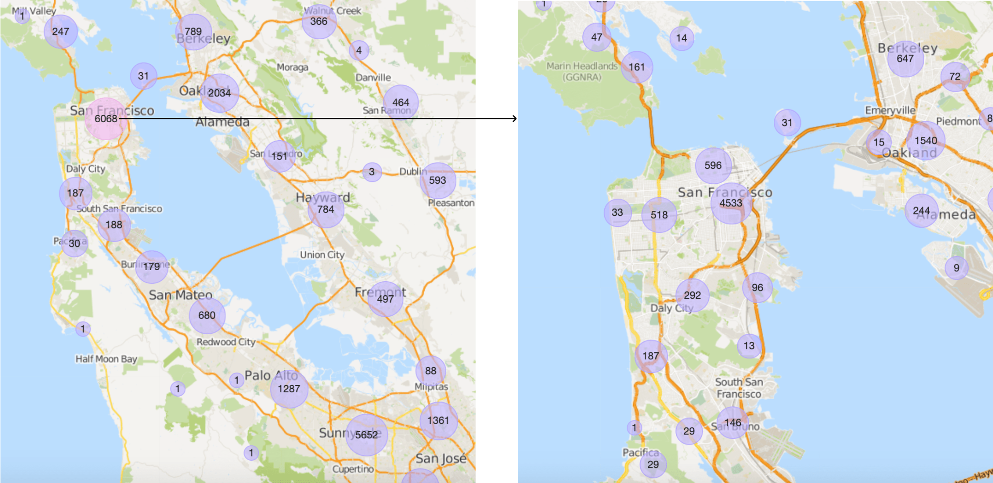
3. Bubble Map
Bubble maps are also known as cartograms and are an extension of the scatter plots. They are a simple yet innovative idea of representing geographical locations. The bubbles are overlaid on a map and represent the latitude and longitudes coordinates.
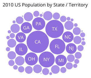
4. Bubble Clouds
Also called the circle packing charts, bubble clouds look like bubble charts from a surface view. The circles are tightly fitted and packed together to only represent one value. They may be clustered together in a haphazard position or ordered according to their value. Often the bubbles are also encoded with colors for a better comprehension of the graph.
Step 1: Open Microsoft Excel on your computer.
Step 2: Insert your data in the table or open a pre-made file to start creating. For opening the file, click on the File tab in the upper left corner. Next, click the Open tab. A dialogue box will appear. Select your file and click Open.
Step 3: After inserting the data select the data range for the area chart using the cursor.
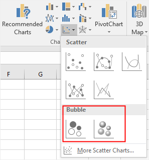
Step 4: Go to the Insert tab in the Charts group and click on Scatter Plots. A menu will appear. Here, go to the bubble chart and select the type of chart you want: 2-D or 3-D.
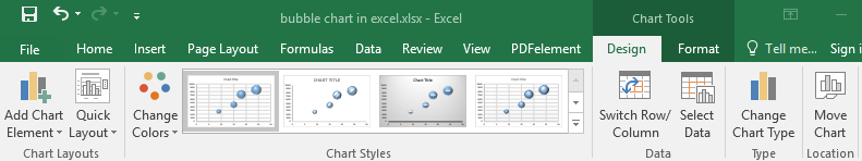
Step 5: You can also edit your chart via the available tools. Select the chart area and Chart Tools will appear. Here, you can change the chart style, layout and type. Click on the Add Chart Element to add axis titles and data labels.
Step 1: Download and load the EdrawMax software on your PC.

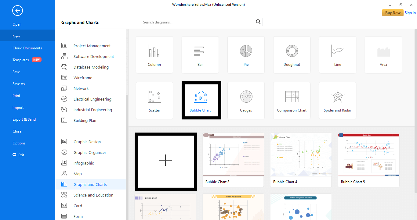
Step 2: In the left column, go to the New tab and select the Graphs and Charts tab from the menu.

Step 3: Next, select the Bubble Chart tab. A range of templates will appear. Select a pre-made template or start from scratch by clicking the plus-shaped icon. (+).
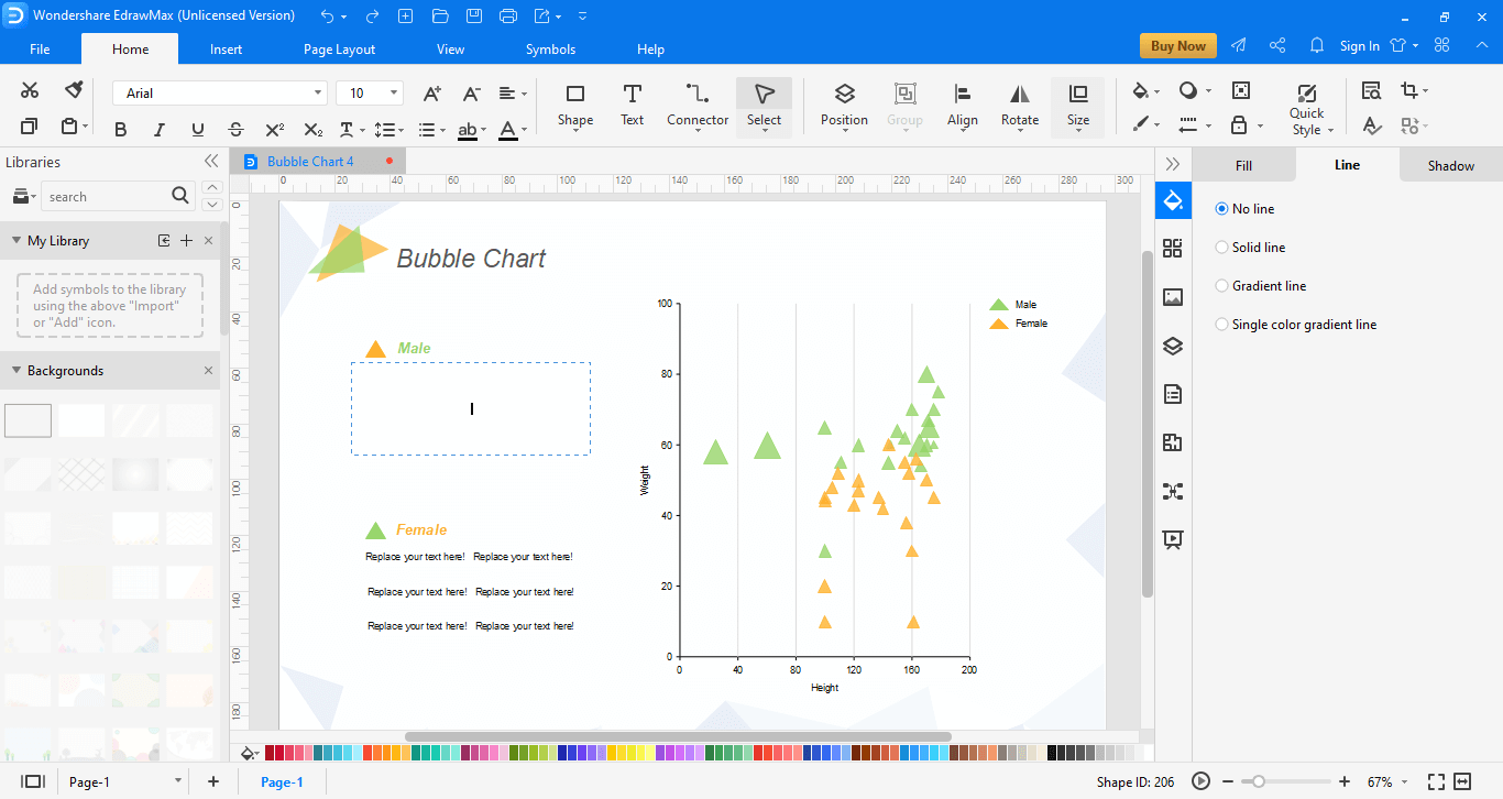
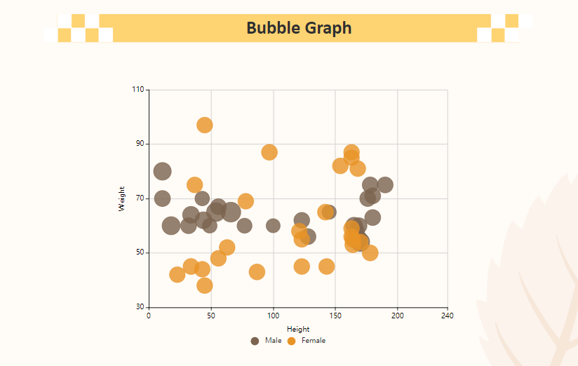
Height and Weight Comparison
This is a simple bubble chart that compares the height and weight of males and females. The three variables here are weight, height, and gender. Axes have been sketched for the average values, and the colors are assigned to each sex. This type of graph enables us to assess that males usually tend to grow higher while females are fatter.
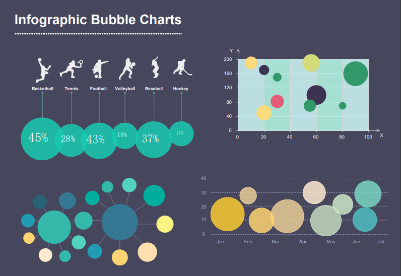
Sports and Games Chart
This is another colorful and innovative template that allows us to compare different types of sports. It mentions the percentages for each game and draws three different types of bubble diagrams. It can be seen that the bubbles differ in their diameter due to the difference in values. Such diagrams are of great help when you want to make a thorough comparison.
I'm sure this guide has helped answer all your questions about Bubble charts and why they are so versatile. To help you understand them better, I have added a few templates from Edraw's collection. Use this user-friendly software and its array of tools to spark your creativity and design the most innovative and informative Bubble Charts in no time at all.

