When to Use Pie Chart - Things You Should Keep in Mind
What Is a Pie Chart
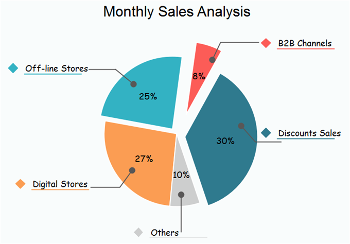
Pie charts are circular graphs that reflect the related parts of different data groups or categories. Pie charts show users what a fraction looks like on a paper in a good visual representation of different data sets. Every 1% contribution of a part to an overall pie chart corresponds to a 3.6 degree of angle. Generally, pie charts are cut into different sized slices to show specific percentages for each part.
When to Use Pie Chart - Key Criteria
In reality pie charts are easy to be abused. You should bear in mind the following important aspects when drawing your pie charts.
Meaning
Make sure the parts of your pie chart make up really meaningful concepts as a whole pattern. Otherwise, you should think about other types of charts. Keep in mind pie chart should make sense to your readers in terms of texts. Practical examples of using a pie chart including comparing growth areas for business turnover or profit.
You should not make any apparent mistakes by setting exclusive parts, numbers or percentages into your pie chart. If you find overlaps between your figures, try to reset your data or use other types of charts. If you have very similar sized categories, you should be careful with interpretation.
When to Use More Than One Pie Chart?
More than one pie chart could be used to compare multiple data categories when you have several different data points with distinguished data details. Usually, in such cases, data groups are identical or similar but have a difference in a specific variable, such as time or age factors. It is very meaningful to keep the same ordering or slices pattern in the second or more pie charts to facilitate comparisons. Be careful magnitudes of slices in your additional pie charts may no longer show the same as in the first one.
Using Pie Chart - Further Tips
- Using Colors: It is really useful to shade or color different slices in your pie charts from light to dark. This can enhance the data presentation.
- Avoiding 3D Effects: 3D effects are cool, but you should not consider them in the first place to highlight your data in a pie chart. 3D elements may detract your attention from the important message so you feel hard to compare sizes of different data groups. Also, the use of 3D effects will exaggerate the real influence of your data percentage.
More Free Pie Chart Templates
The following free pie chart templates includes the main categories of charts for business and educational uses. Feel free to click on any of them to see more details.
|
|
|
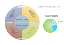
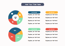
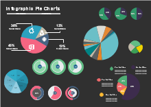
| Temperament Categories Diagram | Pie and Doughnut Chart | Infographic Pie Charts |
Easy Pie Chart Software
The Edraw chart maker has rich built-in chart templates and it offers a highly convenient way to create column, bar, pie, line, area, scatter, spider and gauges charts. It is also easy to import data from local files, or one click set different options like the category and series number, the legend and axis, the axis tick number and category interval etc.

You May Also Interested In:
Top 10 Types of Charts and Their Uses

