Survey Result Reporting Charts - Customizable Templates Free Download
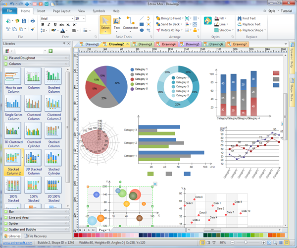
Survey Result Reporting Chart Software
Successful survey result reports involves good-looking charts and graphs. Survey report charts helps present data information visually. It's more intuitive for readers to understand the result than reading words only. What charts can be used for survey result reporting? Well, a lot of people use pie chart, column chart, bar chart, line chart and scatter plot for showing survey results. For some investigation agencies, newspaper offices, and web bloggers, communicating survey results to the audience in a way that is both professional and easy to understand is a crucial skill. The best solution is to get an all-in-one charting tool, and Edraw is an expert. With extensive pre-made templates of pie chart, column chart, bar chart, line chart, scatter chart, bubble chart and radar chart, it helps you make excellent survey result reports with a few clicks.
Download a free trial and see first-hand how quickly and easily you can create great-looking survey report charts.
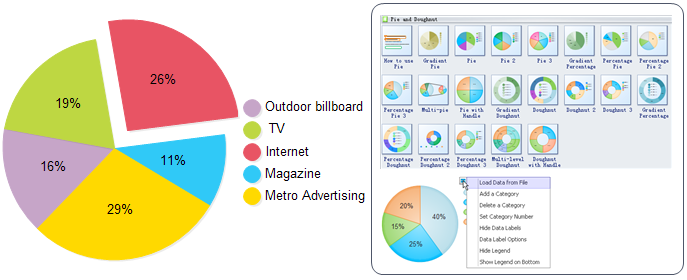
Survey Result Reporting - Pie Chart
A Pie chart provides a comprehensive view of the proportions each part takes in an easy-to-understand way. It's a useful tool helps you figure out and understand complex data, which is widely used for newspapers, magazines and businesses to present survey results.
Edraw pie chart maker offers smart pie chart templates allowing you to create pie chart with only a few clicks. Its friendly interface, extensive symbol libraries and handy templates make the creation experience not only convenient but also entertaining.
Tutorial: How to Create Pie Chart
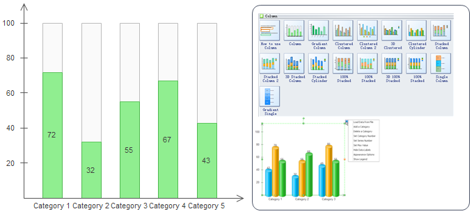
Survey Result Reporting - Column Chart
A column chartis a chart with rectangular bars of lengths usually proportional to the magnitudes or frequencies of what they represent. It's best for comparing means or percentages between 2 to 7 different groups.
In EdrawMax, there are different styles of pre-made column chart templates allowing you to choose in the column chart library. You can even create a column chart through importing a data file, which is amazingly fast. It does save a large amount of manual work and endless adjustments of graphical elements. Try it and experience the magic of this software.
Tutorial: How to Create Column Chart
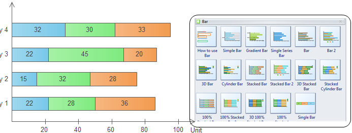
Survey Result Reporting - Bar Chart
A bar chart is a horizontal column chart used to compare data points in one or more data series. Bar charts can also be used for more complex comparisons of data with grouped bar charts and stacked bar charts.
Using pre-made bar chart templates, you can finish a high-quality bar chart with just a few clicks. Every time you open the bar chart tool, the first thing that comes into eyes is the guide of "how to use bar". Additionally, every time you move the cursor over an icon of example or shape, it will automatically shows you how to apply it, which is extraordinarily thoughtful and time-saving.
Tutorial: How to Create Bar Chart
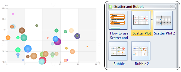
Survey Result Reporting - Bubble Plot
A bubble chart is used to visualize a data set with two to four dimensions. The first two dimensions are visualized as coordinates, the third as color and the fourth as size. It's usually used to display complex data for a survey result. You can use a Bubble chart when you want specific values to be presented in your chart by different bubble sizes.
Through Edraw bubble plot maker, you can set chart data conveniently by loading data from file. You can change the format of bubble plot charts flexibly, including adjust sizes, colors and fill effects of individual bubbles or an entire bubble series.
Tutorial: How to Create Bubble Chart
Video - Create a Scatter Chart
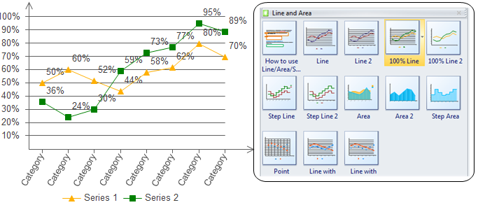
Survey Result Reporting - Line Chart
A linechartisatypeofchartwhichdisplaysinformationasaseriesofdatapointscalled'markers' connected by straight line segments. It illustrates the dynamics of data over a particular interval of time, which is a basic chart type used for showing survey result.
Edraw automatic line chart tool provides you with a fast line chart diagramming method. Simply drag a finished line chart from the library, input your data, and Edraw will automatically generate a line chart for you without any drawing work, fast and convenient.
Tutorial: How to Create Line Chart
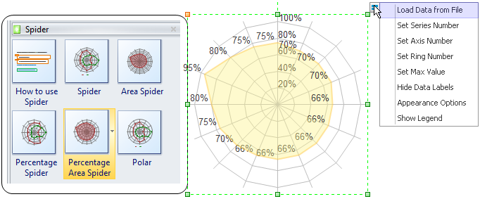
Survey Result Reporting - Spider Chart
Spider chart, also called radar chart, is a graphical method of displaying multivariate data in the form of a two-dimensional chart of three or more quantitative variables represented on axes starting from the same point. As a data visualization tool, it's always taken for researchers to display survey results.
As you see below, you can easily make a complex spider chart from ready-made templates. By importing a data file, the process is streamlined to just a few clicks.
Tutorial: How to Create Spider Chart
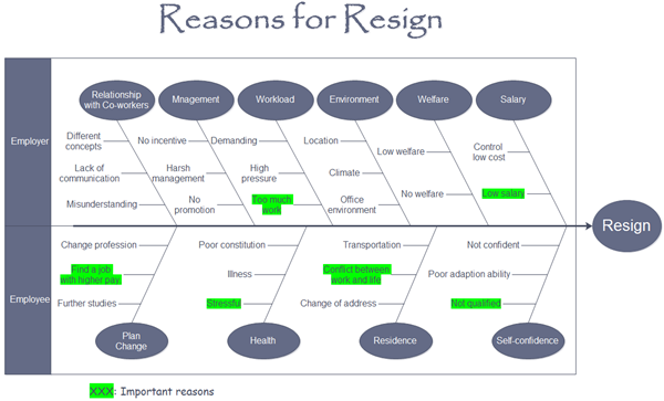
Survey Result Reporting - Fishbone Diagram
Fishbone diagram is used to display the result of potential causes of a problem that you have explored. The fishbone structure can help sort ideas into different categories. With this visual tool, you can easily display all possible reasons for a problem that you have investigated.
Edraw fishbone diagram software enables users create quality fishbone diagram instantly from templates. The interface is super user-friendly so that anyone can master the software quickly, without learning curve and no drawing skill required. Simply drag and drop symbols, apply built-in designed themes, and automatically share your finished fishbone diagrams into a presentation or PDF by only one click.
Tutorial: How to Create a Fishbone
More Materials:


