Pareto Chart - A Six Sigma Tool for Measuring Process Performance
What is Pareto Chart?
Pareto chart, one step of Six Sigma chart which combines a bar chart and a line chart, is observed by an Italian economist Vilfredo Pareto and generalized by Joseph M. Juran. Previously the main function of this chart is to evaluate which might be the most common cause of the deficiency. Later it is widely used to emphasize the importance of reasons among all elements.
The horizontal axis of a Pareto chart shows main elements which influence the quality of a program. The sequence of those elements is less and less important from left to right. Besides, left vertical axis of the chart represents the frequency of occurrence while the right vertical axis shows the cumulative percentage. Thus, the height of each bar acts as influencing the degree of each element and the upper line indicates the cumulative frequency line.
How to Measure Process Performance in Six Sigma by Using Pareto Chart?
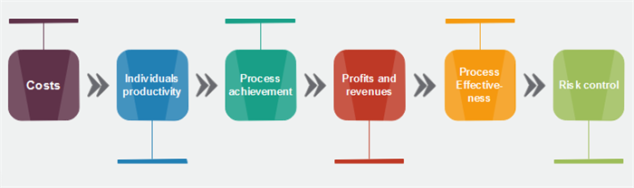
1. Layout Process Performance Metrics
-
Costs
Costs are obvious and intuitive to manifest direct performance in whichever process. How much money and input you spend on the process demonstrate the core factor of program engagement and nothing is more accurate than costs. -
Individuals Productivity
Engagement of individuals contains both inputs like productivity and execution and output like productivity in revenue, expertise, and self-improvement etc. From this process, if individuals have progressed, process performance shows a great success. -
Process Achievement
The initial metrics of measuring process performance is to know whether your process is finished or not. If it is a failed project, all operation steps might have some deficiencies to fix. However, if the project is successful to complete, there might not be so many serious problems but just some bugs. -
Profits and Revenues
The importance of profit and revenue is obvious when measuring any processes. Revenue and profit can be calculated and presented as a data report, so they could not be controlled and intervened by any other external forces. -
Process Effectiveness
Customer satisfaction situation, representing process effectiveness, benefits for regular purchase, so this index is the only qualitative metric among all factors. -
Risk control
Whether the project is finished or not, risk control should be a key element in measuring process performance as risks might be a hidden peril which is invisible and difficult to perceive.
2. Pareto Analysis Procedure
After clarifying the metrics for measuring process performance, the Pareto chart has a basic structure to be analyzed step by step.
- Fix time scope to know what your Pareto chart might cover and examine.
- Label bars under horizontal axis to arrange previous metrics in descending order.
- Collect data on occurrence number and calculate the cumulative percentage. (Tips: Cumulative percentage= [Individual Count] / [Total Count]*100)
- Plot two axis and put counts with bars to the left and percentages as points to the right.
- Join the points to the line and construct bars.
- Draw a line of 80% and divide the horizontal axis into two parts. Factors on the left are more meaningful than factors on the right.
3. Sum up the Result
After analyzing most influential factors in affecting performance, you can put forward a summary of how to measure process performance by Pareto chart.
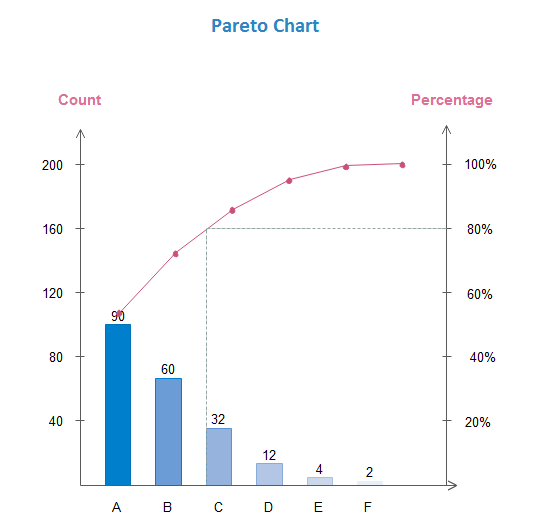
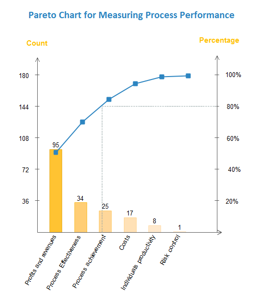
A Pareto Chart Example
Below is a pareto chart example create with Edraw. Click the image you can download the template and customize it.
Download Edraw to Create Pareto Chart and Many Charts and Graphs:

