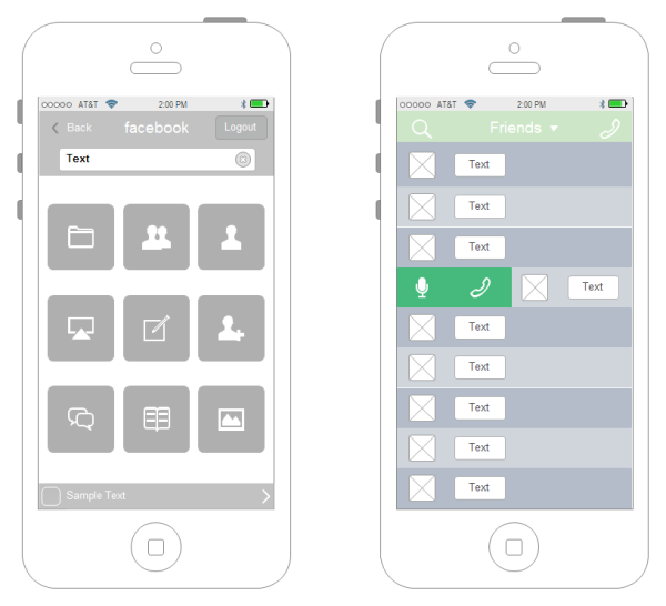
Wireframing, Mockups and Prototyping for iPhone Design
Still worried that you do not have an advanced mockup & prototyping tool for iPhone design? An easy wireframing tool plays and shares high fidelity mockups using native iOS interface elements: it is the ultimate toolbox for anyone who wants to start creating a wonderful App. From idea to mockup and beyond, it is easy for anyone to achieve professional results.
Easy Wireframing Tool for iPhone Design
An easy wireframing tool makes it easy to dive in and start building your app prototype right away. An easy wireframing tool also has tons of features to build your prototype the way you want, including import tools, links, and transitions. Edraw is one of the easy wireframing tools which enable you to quickly and easily create prototypes that look just like the real thing.
A Beginner's Guide to Wireframing
Excellent Wireframing and Prototyping Tools for Windows
UI Mockup Tool - Help Plan Your Website
Prototyping your app idea with an iOS mockup tool is the most important step in the app creation process, allowing you to brainstorm functionality and better communicate to your team exactly how the app works. Edraw software is an iPhone wireframe tool for both “idea people” and experienced designers and developers.
Steps to Wireframe a Simple iPhone Design
Focus on User Experience. Wireframes should be as bare as possible. That is because you want your client to judge the user experience rather than the look. Using real dimensions and grids can be good, do it only if you have confidence. Knowing realistically how much content can fit in a single screen can make or break a concept. From my experience, within the constraint of time, the closer you can get to the real product the better. That is because being in front of a high-fidelity mockup can largely influence important product decisions such as navigation complexity, content fit, usability, overall value, etc. I try to look at all my designs from my phone's screen simply because the experience can be dramatically different from looking at mockups in low resolution from a computer screen.
Colors. The most efficient wireframes I've seen use subtle tones of gray or blue. Ideally, the shades should be neutral and consistent so that you can focus on the structure and not be distracted by strong colors. Since colors can be hard to master, use real colors at your own risk.
Icons. Since user interface design can often make use of icons, don't be shy to pick standard icons to represent key actions. It can help make the decisions of either going text only, icon only or text with icon. By now, you should have gathered a nice collection of icon sets that will help you brush through this process with ease.


