Guidelines to Design a Killer Infographic Header
Infographic is one of the best tools to visualize information to an easy-to-understand and interesting way. Lots of infographics hit the web every day, and they even change our ways of getting and sending out information. In order not to fall behind others, it's time to learn how to create infographics and use in business. We have already wrote an article about howtolayoutinfographics,butit's still necessary to take a separate article to talk about the infographic header design.

Why header is so important?
Positionally, header is on the top of an infographic, which according to readers' reading habits, first comes to their eyes. It may decide whether people will go ahead with the body content or not. So the header's job is to entice readers and capture their attention so that they will continue with more details.
How to design an effective and enticing header?
Good header involves with nice font, arrangement, background, embellishments, headline writing and so on. The general rule for header design is to make the header attractive enough while keep the color or theme as consistent as possible.
Choose a Background for Your Header
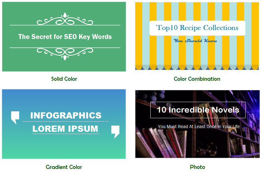
Header background can be solid color, gradient color, pattern or photo. Usually the background color of the header should be different with the body. You can use completely two different colors or use two-tone colors to make it contrast. In this way the header can be easily noticed.
When you use a photo, choose one which could reflect the content of the infographic. The photo shouldn't contain too many details, as they might distract your attention from the headlines.

Use Different Fonts
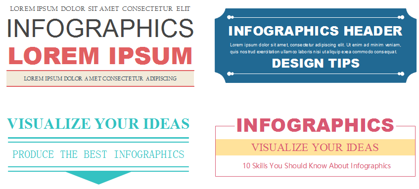
Fonts can truly accentuate the appeal of your infographic header. It's not only about what font you choose, but also critical on how you would mix different fonts together. If you do it well, it can result in unexpected striking effect. It's important to make the font size different. The more emphasis you want to put upon a word or phrase, the bigger font that word or phrase should be. What's more, using particular colors is also a way to highlight key words.

Add Embellishments
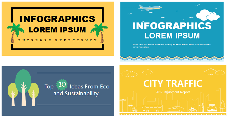
Embellishment could be icon, line, border, clip art, etc. The icon or clip art should reflect the main content. Embellishments could make your header more vivid and engaging. However, not all headers require embellishments. For example, if your infographic focuses on a simple style, it's better not add too many embellishments.

Write a Striking Headline
Headline writing must be clear, relevant and enticing. Here are some tips of how to write catchy headlines.
- Use numbers.
- Use engaging adjectives.
- Use interrogative adverbs such as how, when, which, etc.
- Suggest the best way to do something.
Here are some examples:
- 10 of the Best Free Vector Image Sites.
- 30 Simple Habits to Make Yourself Better.
- How to Draw an Infographic in 10 Minutes

