Gauge Chart
Part 1: What are Gauge Charts?
In our lives, there are times when we feel the need to observe, record, or show data. For this purpose, different types of tools can be used. A gauge chart (Dial chart or Speedometer chart) is one of these tools.
A gauge chart is a chart that indicates the reading or information on a dial with the help of a needle. They are handy for the comparison of a small number of variables. They usually have ranges and help you easily assess the current value and what it means.
One of the most common examples of a gauge chart is a speedometer. They can also be customized according to your needs and can be used in different fields such as business departments, scientific experiments, etc.
In this article, we shall enlighten you with all the ins and outs of the gauge chart .
Part 2: Types of Gauge Charts
Gauge charts are of various types depending upon the data, size, and shape. Here, we are going to familiarize you with a few types.
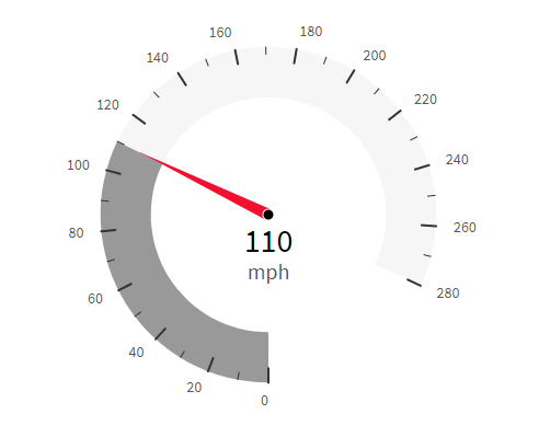
● Speedometer
A speedometer is a type of gauge chart that is most commonly seen in everyday life.
● Quarter Gauge
As the name suggests, a quarter gauge is one-fourth of a circle.
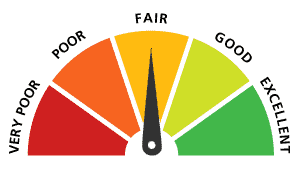
● Rating Meter
A rating meter is another type of gauge chart. It is a semi-circle chart that has a pointer that indicates a specific value.
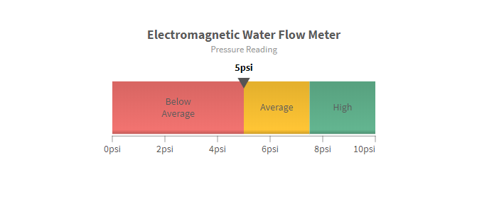
● Linear Scale
A linear scale gauge is ideal for range-related work. It is a rectangular horizontal bar that is divided into different ranges and is also color-coded.
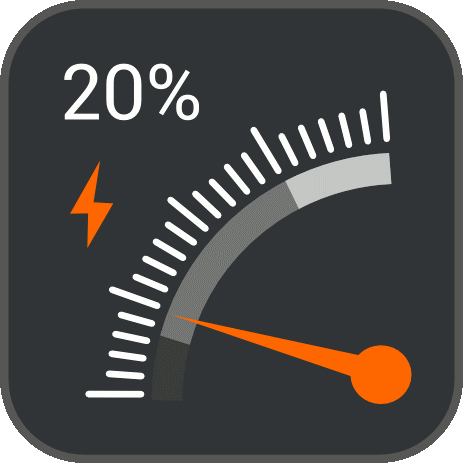
● Bulb Gauge
A bulb gauge has a very interesting mechanism. Based on the different ranges, the bulb emits different colors of light.
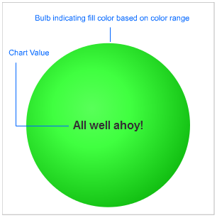
The figure above shows a bulb gauge that indicates the coolness in the freezer. Different colors mean different things: green means good, yellow means caution, and red means warning.
There are many different types of gauge charts, but we have listed only a few here. Other types of gauge charts include Cylinder fill charts, LED gauge charts, thermometer gauge charts, etc.
Part 3: Advantages and Disadvantages
Like all things, gauge charts come with their advantages and disadvantages. Let’s have a look at them.
Advantages of Gauge Charts
Following are the advantages of gauge charts:
- User-friendly: Gauge charts are extremely user-friendly. The audience can understand them at one glance.
- Non-technical: There is no technicality behind the making of a gauge chart. They are straightforward to create.
- Color Coding: The option of color-coding makes the observation of data efficient.
- Good for Comparison: Due to their user-friendliness and easiness of creating, they are very good for comparing two data sets having a standard feature.
Disadvantages of Gauge Charts
The disadvantages of gauge charts are as follows:
- Need Context: Due to their simplistic nature, they can not be understood without context.
- Take Space: When representing multiple sets of data, they take up a lot of unnecessary space.
- Not Compatible with Complex Data: It is difficult to represent complex data sets with multiple scales.
- Not for everyone: These charts are greatly inefficient for color-blind people.
Indeed, the advantages outweigh the disadvantages.
Now, let’s take a look at the guide for creating gauge charts. We can use different software for this purpose. Here, we will be discussing Microsoft Excel and EdrawMax.
Part 4: How to Create a Gauge Chart in Excel?
Microsoft Excel is one of the most used software and is easily accessible. It can be used for different purposes, but today we will be guiding you through the steps of creating a gauge chart (speedometer).
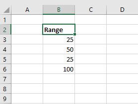
Step 1: Add a Range
A gauge chart has different segments of ranges. For that purpose, make a range column and add your values.
Step 2: Add Doughnut Chart
Now, select the range and go to the Insert tab. Go to "Charts" and click on the pie chart option.
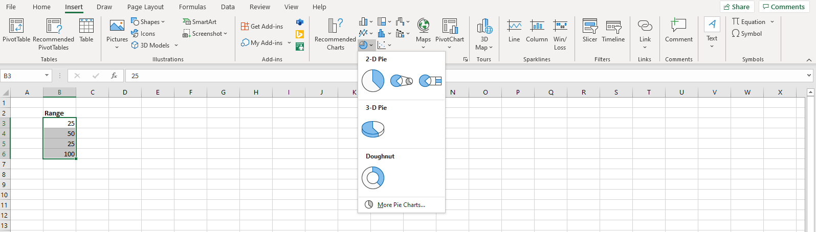
From the drop-down, select the doughnut chart. Your chart will appear on the screen.
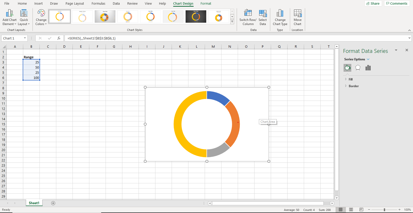
Step 3: Edit the Doughnut Chart
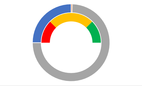
First of all, change the colors of the doughnut. To do that, either right-click or click on the "Fill" option on the right side. Change the colors of the first three segments as per your requirement. The fourth segment will be set at "No Fill" (this is because we only need a semi-circle).
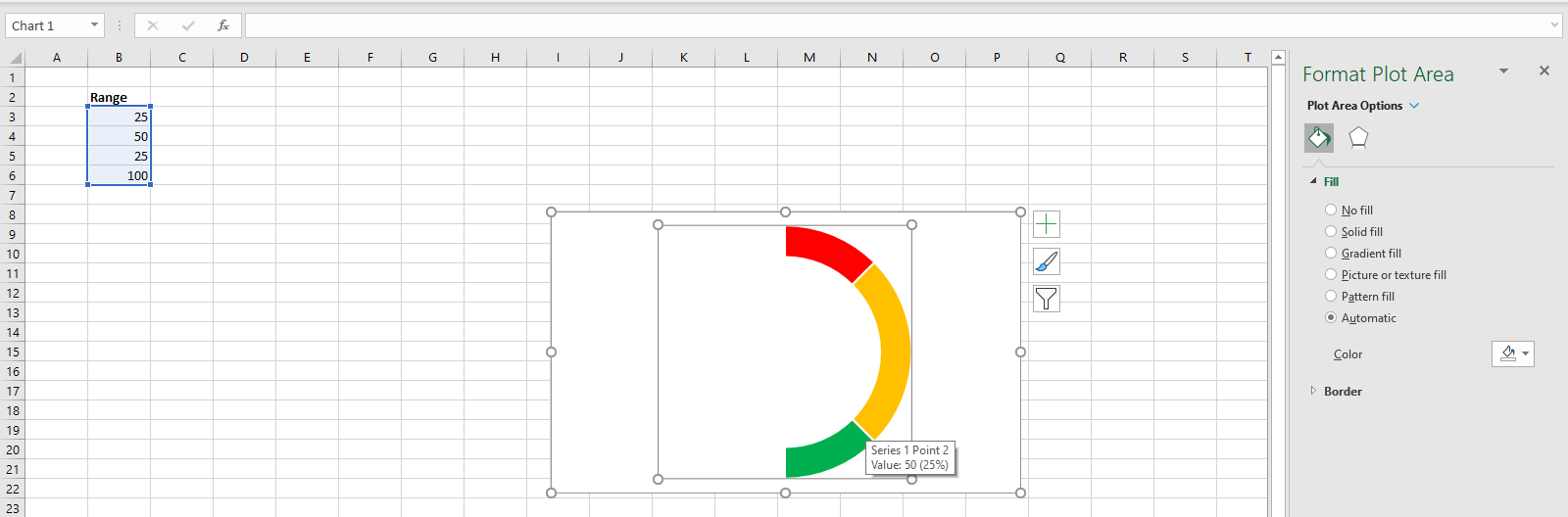
Now, right-click on the chart and select "Format Data Series." Here, set the "Angle of first slice" to 270 degrees.
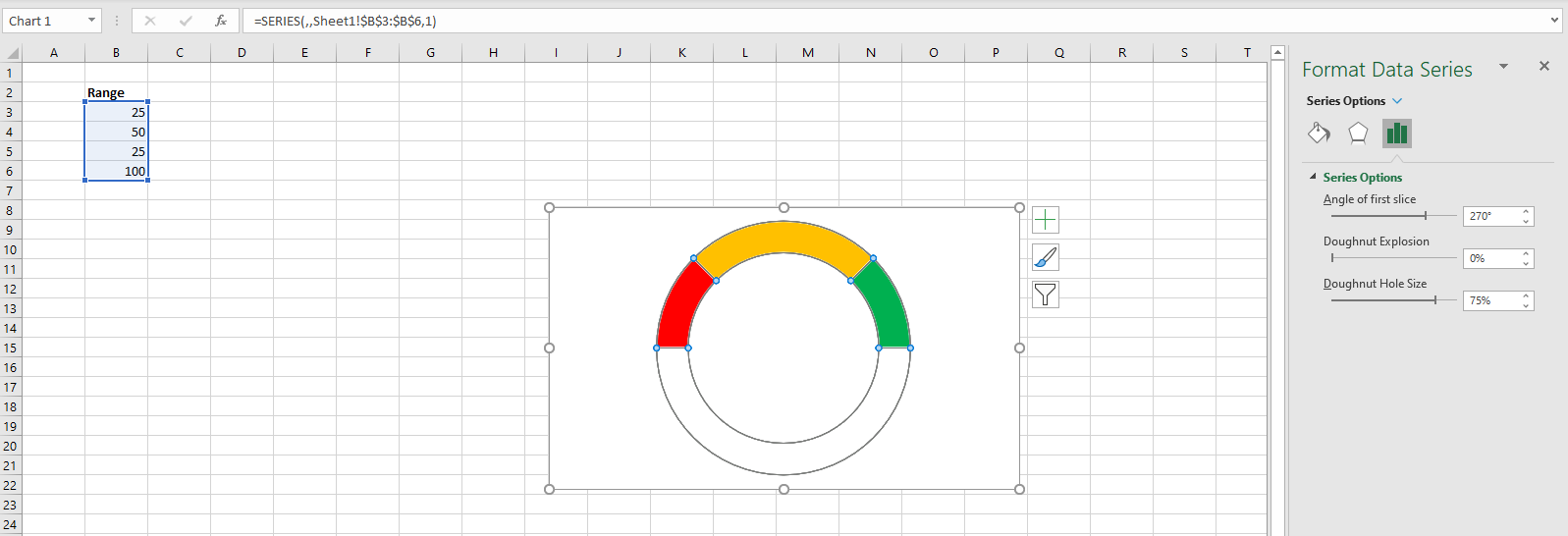
Also, adjust the "Doughnut Hole Size" to make a thicker graph.
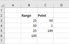
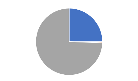
Step 4: Add Pie Chart
Now, add values for the pie chart. The first entry is the value of completion (let's say 50% of the project has been completed). The second entry is one, and the third entry is a formula, i.e., 200-(entry 1)-(entry 2).
Now, click on the doughnut chart and press right click and click "Select Data." A pop-up will appear.
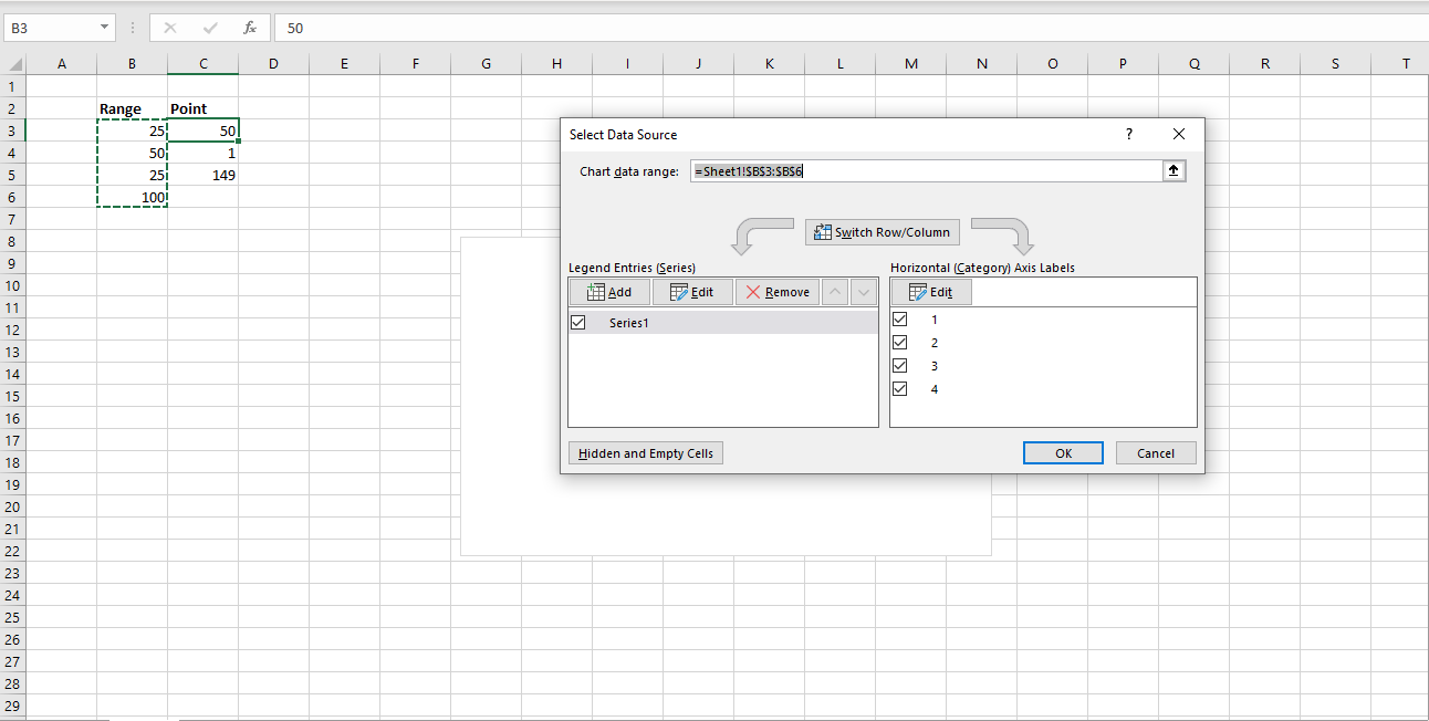
On the left of the pop-up, tap on "Add" and select the new entries. Click "OK," and your chart will look like this.
Step 5: Edit Pie Chart
Now, right-click on the outer chart and click on "Change Series Chart Type." A pop-up will appear.
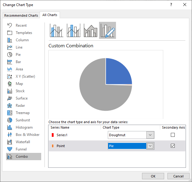
At the bottom of the pop-up, choose the Pie chart from the drop-down menu in front of "Point." Also, check the "Secondary Axis" box. Click "OK."
Since we only need a pointer, we will only keep the second data point. Therefore, we will make the other two data points transparent by adding "No Fill." Make the double data point black.
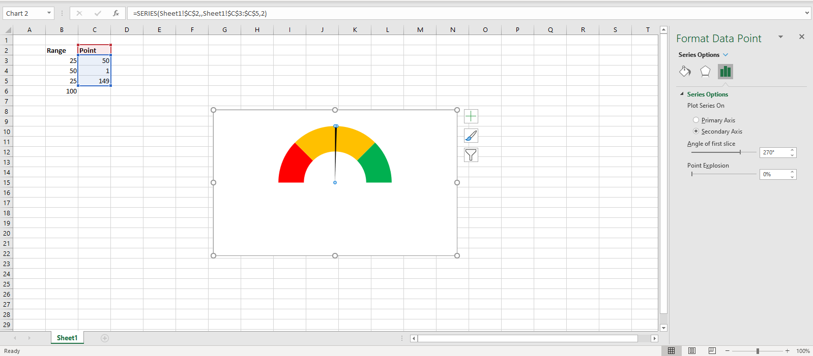
Add the 270-degree angle, and your gauge chart is ready!
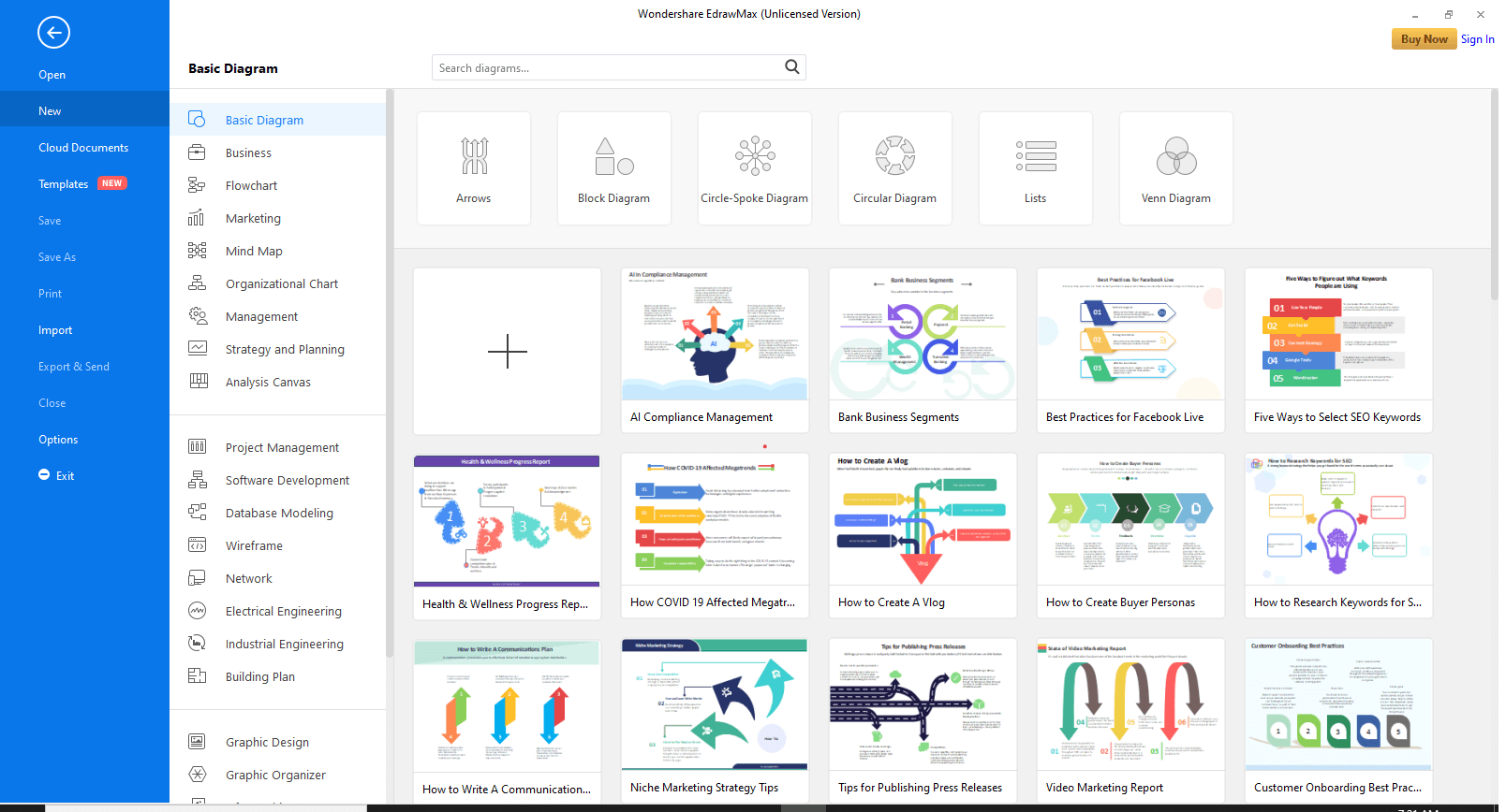
Part 5: How to Create a Gauge Chart in EdrawMax?
EdrawMax is one of the most useful software for data representation. It has inbuilt templates that help you create your desired visualization tool quickly. To create a gauge chart, follow these steps.
Step 1: Install EdrawMax
Go to the official website of EdrawMax and download the software.
EdrawMax
All-in-One Diagram Software
- Superior file compatibility: Import and export drawings to various file formats, such as Visio
- Cross-platform supported (Windows, Mac, Linux, Web, Android, iOS)


You have both the free and paid version available. For basic tasks, the free version is sufficient.
Step 2: Launch the App
Once the software has been installed, open EdrawMax. The interface will look like this.
At the top right corner, there is an option to sign in. This will enable cloud storage. However, you can use EdrawMax without signing in as well.
Step 3: Open a New Canvas
Click on the "+" sign to open an empty workspace.
Step 4: Go to Insert
At the top, go to the Insert tab.
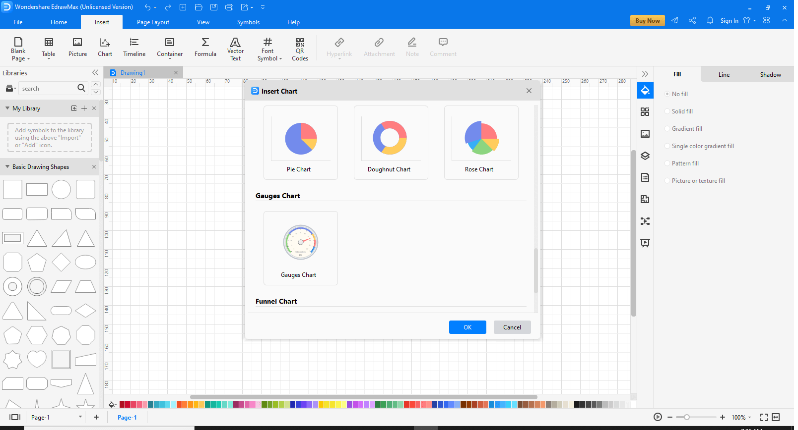
Click on "Chart" to view the templates. A pop-up will appear.
Step 5: Choose template
Scroll down to find the "Gauge Chart".Select it and click "OK."
Your gauge chat will appear on the canvas.
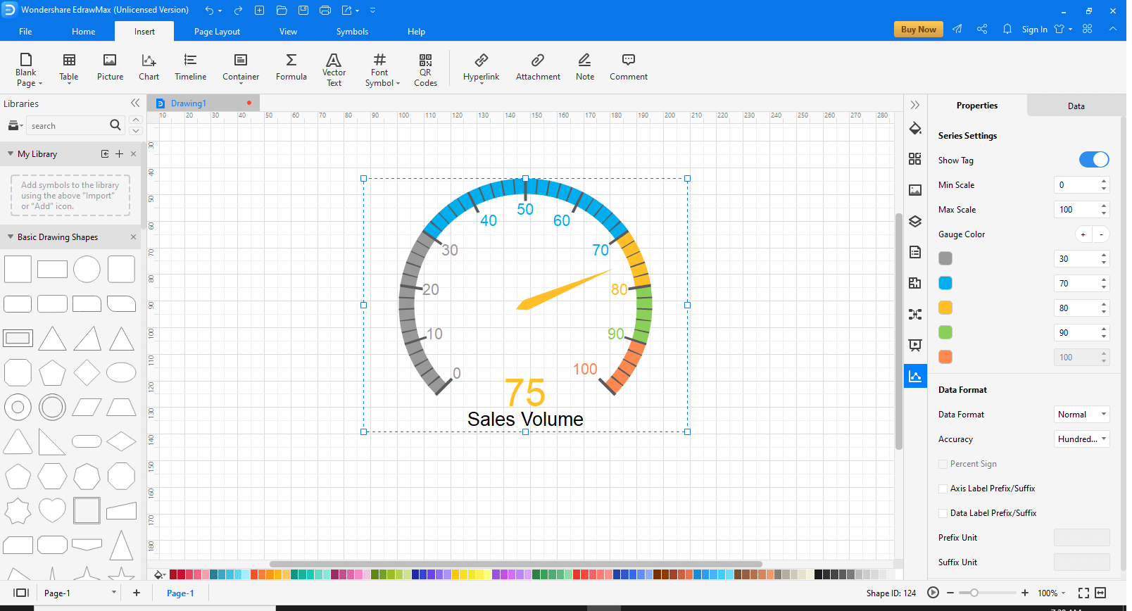
On the right of the screen, Properties and Data tabs will appear. Use them to edit the template according to your requirement.
After you are done editing, press "Ctrl+S" to save the file at the desired location.
Part 6: When to Use?
Are you wondering what uses a gauge chart could be for you? Well, wonder no more!
Gauge charts are best used for measuring the amount or size of something like rain, temperature, etc. So, gauge charts are best to give a visual representation of how something is performing against a set goal. This means that they are often used in situations where you know what the norm or correct value is supposed to be.
For example, a thermometer in a chemical lab will tell you the temperature of a chemical. The chemist is aware of what the ideal temperature of the chemical should be, and thus, the gauge will tell him whether the temperature is at the perfect value or lower/higher than it.
Other situations in which gauge charts are helpful are as follows:
These are some examples of where and when gauge charts can be used. You can also adjust and customize the gauge charts as per your requirement and use them in any way you wish.
Part 7: Examples of Gauge Charts
Example 1
This is an example of a dial chart showing the Body Mass Index (BMI). The BMI number determines whether an individual is healthy, slightly overweight, or overweight.
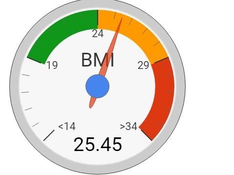
The dial chart above is indicating the BMI number with the pointer. The colors show the category the person falls into (green for healthy, orange for slightly overweight, and red for overweight).
Example 2
This is a rating meter used to assess the satisfaction of customers at Walmart. The chart is divided into three segments according to the ranges.
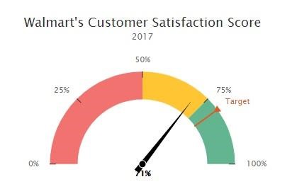
Walmart set an 80% target, and the needle shows how much customer satisfaction was achieved in 2017.
The gauge chart that meets the user's requirement should be as follow:
Multiple gauges may also be rendered on a single chart surface. Therefore, you many choose more than one gauges to visually display your date from different aspects.
Part 8: Conclusion
Gauge charts are an essential data visualization and data analysis tool. It is effortless to use, create and work with. The different types enable you to use it for other purposes. You can make them with whichever software you have on hand, whether it is Excel or EdrawMax.
So, go ahead and work out your gauge chart !

