Design a Subway Map Effortlessly in Minutes
Purpose of Subway Map
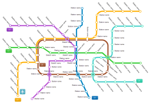
Like any other tool, a map should be judged on whether it serves its intended purpose. Simply speaking, a subway map aims to tell people how to get from here to there: which line to take, which station to get off and how far it is. Essentially, subway maps need to communicate the order of stations on each line, the stations where the lines can be transferred and a rough approximation of where the stations are in relation to each other.
An Easy Way to Design Subway Map
EdrawMax offers you fresh drawing experience with edge-cutting technology. Use Edraw to design a subway map is surely effortless and fast. It lets you add new stations, change lengths, and add text labels and icons easily. Follow a few simple steps to draw an amazing subway map.
Open Subway Shapes Library
Firstly, open the library containing all vector shapes you need for a subway. Go to page Subway Map Symbols for more detailed explanation of these symbols and how to use them.
Draw Metro Lines

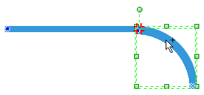
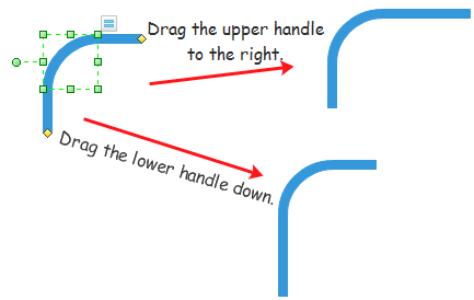
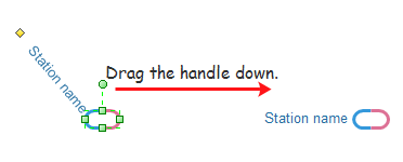
To use the yellow control handles, select the shape firstly and then drag them according to your need.

Add Stations
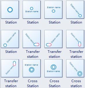
Edraw include three types of station based on subway features: Station, Transfer Station and Cross Station.
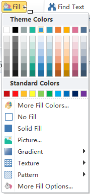
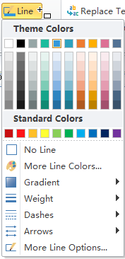
Fill Each Line a Different Color
Rules to Draw Subway Maps
Rule 1: Make sure that adjacent and non-adjacent stations keep a certain minimum distance. Stations may not intersect each other or overlap vertices and edges of the map. This keeps the map more readable.
Rule 2: Keep the number of bends along a certain subway line small, especially in interchange stations where several lines intersect. If bends are unavoidable, obtuse angles are preferred over acute angles, i.e., the order of preference is 135, 90, and 45 degrees. This rule helps passengers read the map with their eyes easier.
Rule 3: Preserve the relative location between subway stations. For example, a station to the east of another station in reality should not appear to the left of that station on the map. This supports the (geographic) mental map of the passengers.
Rule 4: Label stations with their names, and ensure that labels do not obscure other labels or parts of the diagram. Preferably all labels between two interchange stations are positioned on the same side of the line; stations on a horizontal line may also be alternatively labeled above and below the line to save space. Labels are essential readability of a map.
Rule 5: Use distinctive colors to denote different metro lines.
City Subway Map Examples
You can take full use of this vectorial file and make some modifications to make your own subway maps. You can be faster in this way. And you can find more resources from these links: City Subway Map; Subway Map.
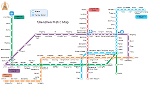
The right picture presents the metro map of Shenzhen (2015). As you can see, Edraw can produce high quality subway map.
Subway Etiquette
To make a better pace for everyone on the subway, the NEW YORK Metropolitan Transportation Agency has rolled out some new signs about subway etiquette. If you often take subway, you need to have look at these Etiquette. No matter where your are from, these rules apply.
"Poles Are For Your Safety, Not Your Latest Routine."
"Hold the pole, not our attention. A subway car is no place for showtime."
"It's A Subway Car. Not A Dining Car." "
It may be take-out, but please, don't eat here."
"keep Your Stuff To Yourself."
"Be a space saver. The less space your things take up, the more room for everyone."
"Dude... Stop the Spread, Please."
"It's a space issue."
"Clipping? Primping?"
"Everyone wants to look their best, but it's a subway car, not a restroom."


