Create Stacked Column Chart in Excel Format
Create stacked column chart in Excel format with an easy tool much better than Excel. As one of the most common chart types, stacked column chart is more useful when comparing the contribution rate of different items to a category. See an elaborate example firstly.
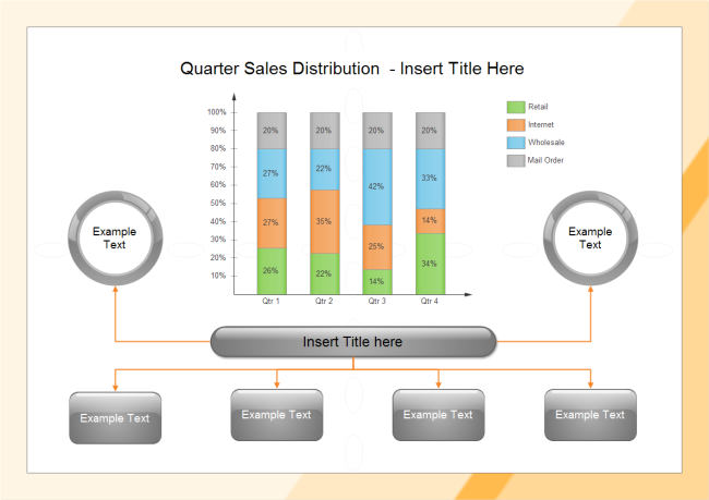
So, how can we create stacked column chart similar with the above one? The following guide and procedure will show you how to do it.
Create Effective Stacked Column Chart
An effective stacked column chart helps readers to understand the statistics and gain insight from them easily. To make effective stacked column chart, make sure that it is: readable, visually acceptable and informative. Follow these rules to gain more effective stacked column charts.
- Note that PowerPoint's default template is not acceptable sometimes. So you might as well learn how to change the formatting or try better charting software.
- Select suitable colors to distinguish different series, allowing different data points to be shown in clear contrast to each other.
- Avoid overusing text. Make sure that any necessary labels are clearly visible.
- Ensure that labels are not overlarge, overlap and that they aren't too brightly colored.
- Don't place bars too far apart from each other, which makes comparing the difference more difficult.
Make Stacked Column Chart in Easiest Software
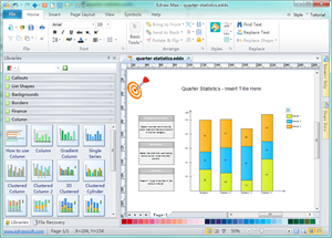
Actually, you can take advantage of automatic column chart software to make stacked column chart faster than using Excel. Edraw is a simple yet powerful tool that has automated many steps. It offers ready to use stacked column chart templates, allowing easy input of data and text. Finally, you can export your chart as Excel file with 1 click.
Video Tutorial - How to Create a Column Chart
Stacked Column Chart Templates
Sales Report Stacked Column Chart
Discover why Edraw is an awesome chart maker: Try it FREE.
Steps to Construct Stacked Column Charts
- Start EdrawMax and choose Chart drawing type.
- Double click Column Chart icon.
- From the template library, drag-and-drop a suitable stacked column chart.
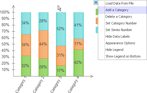
- Rest the pointer over the chart and click on the floating menu to modify the template, such as add/delete a category, and set the appearance options.
- Double click the data label to input your own data. As for the 100% stack column chart, select the shape and then drag the yellow control point vertically to change data value.
- You can change each series' fill color by selecting the sub-shape of the legend. In the legend, click 2 times on the series you want to recolor, and then choose a new color.
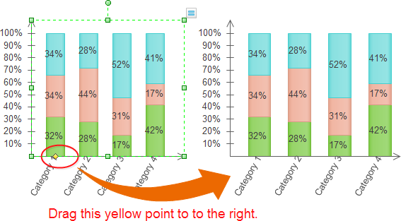
- To change the interval between columns, select the chart. This displays a yellow control button on the bottom of the first category. Drag is horizontally to reduce or enlarge the space between columns.
Export Stack Column Chart as Excel File
To gain stacked column chart in Excel format, do one of the following.
On the Quick Access Toolbar, hit the Export button and choose Excel format. After the chart is exported, you can open it right within Edraw to see the result.
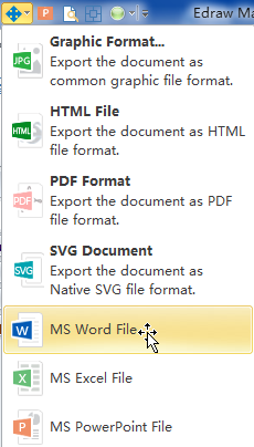
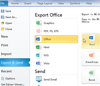
On file tab, Click Export & Send. From the format list, choose Office and then click Excel. From 1 single program, you can gain stacked column chart in various formats, including PDF, Word and PowerPoint.
Stacked Column Chart Templates
Starting from interactive template is the fastest way to create stacked column chart. Edraw offers the following built-in types of stacked column templates.
| Simple Stacked Column Chart |
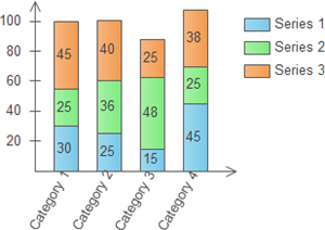
|
| 3D Cylinder Stacked Column Chart |
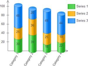
|
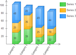
| 3D Rectangular Stacked Column Chart |
|
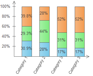
| 100% Stacked Column Chart |
|
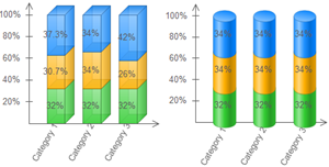
| 3D 100% Stacked Column Chart |
|
Gain more Editable Column Chart in Excel, Word and PowerPoint

