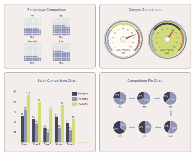
A Simple Example of Comparison Dashboard
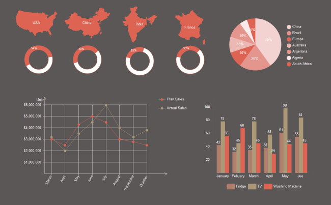
Comparison Dashboard Example
Comparison dashboards are quite common to show the differences between two entities, or present what progress you have made from last time. Many charts and graphs can be used in comparison dashboard, the most widely used ones are column chart, bar chart, pie chart, doughnut chart, gauges chart, line chart and comparison indicators.
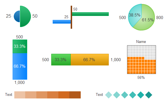
Comparison indicators Used in Comparison Dashboard
There are many types of pre-drawn comparison indicators in Edraw. You can use them to represent your comparison data. The indicators are smart to use. You can simply input your data, and the shape will adjust according to the data you input. Moreover, they are in vector format and very flexible to use. You can change the color, style and size easily.
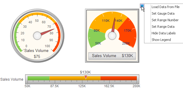
Gauges Chart Used in Comparison Dashboard
Many gauges chart templates could be found in Edraw pre-defined libaries. You can use them in your comparison dashboard. Gauges data could be set through the floating button on the top right corner.
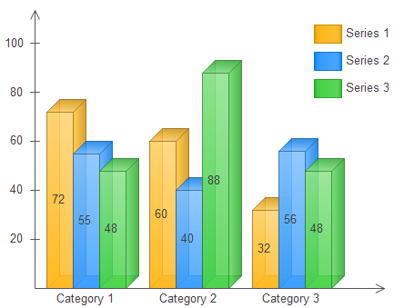
Column Chart Used in Comparison Dashboard
There are many column chart templates available in Edraw for making comparison dashboard, including gradient column chart, clustered column chart, 3D column chart, stack column chart, 100% column chart, etc.
The Advanced Features for Making Better Comparison Dashboard
Edraw dashboard maker comes with a group of smart chart and graph templates that facilitate comparison dashboard design. Learn about the chart features below:
- It has an easy-to-learn and easy-to-use interface, which looks like Microsoft program very much.
- It comes with extensive chart and graph templates, including bar chart, column chart, pie chart, doughnut chart, gauges chart, line chart, etc.
- Many charts have smart behaviors, which greatly simplify your work. For example, by using the floating action button on the column chart, you can one click add a category, set max value, set series number, set tick number, etc.
- It supports data import. By saving the sales data in a file following a certain format, and importing the file to the software, you can generate a chart (pie, column, bar, scatter, gauges, spider, line, area) instantly.
- A set of nice looking themes with advanced effects make it easy to change the whole diagram theme.
- It's easy to add photos, images and edit text fields.
- Enhanced export features include BMP, JPEG, EMF, WMF, PDF, SVG, HTML, Word, PowerPoint and much more format.
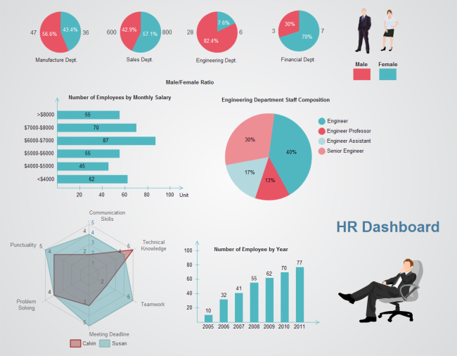
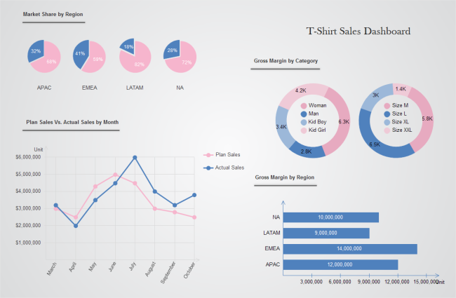
More Dashboard Examples
Besides comparison dashboard, Edraw could also create sales dashboard, report dashboard, retail dashboard, HR dashboard and many more. Here are some examples:


Download a free trial and see how quickly and easily to create great-looking HR dashboard.

