Line Graph - When to Use It?
How and when to use line graphs has always confused many people. This page offers a clear explanation of definitions, features, skills, and using occasions of line graphs.
Part1: Overview of Line Graph
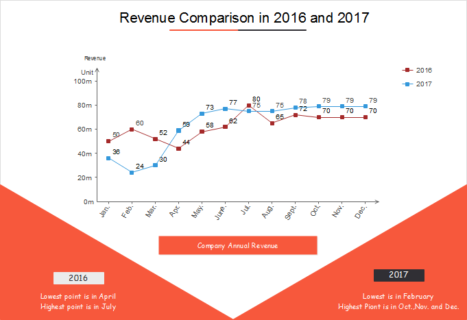
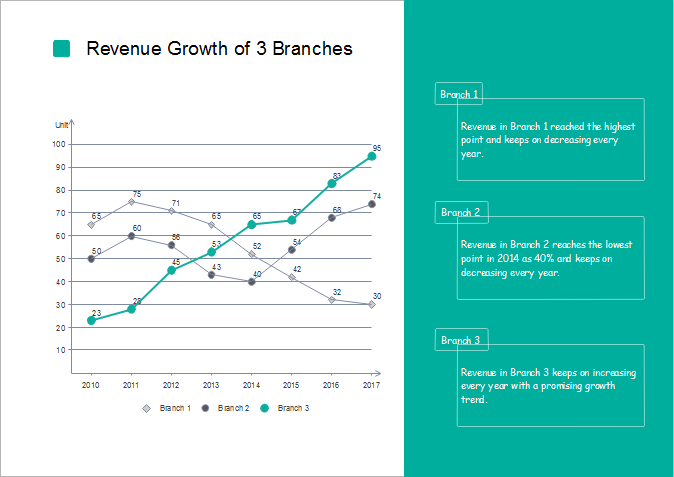
A line graph is a chart used to display a series of data points connected by straight solid line segments. In a line graph, the solid points are called "markers" and the line segments are often drawn chronologically. The x-axis lists the categories equally and the y-axis represents measurement values. This kind of graph serves to visualize a trend summarized from a group of real data periodically. For example, if you need to analyze how the revenue of your company develops in a year, making a line graph would be the most efficient solution. The line graph made by Edraw line graph software below is a very good example:
Download and try awesome chart maker:
Part2: Occasions of Using Line Graphs
When to use a line graph? The situations that you need to visualize your data with a line graph are shown below.
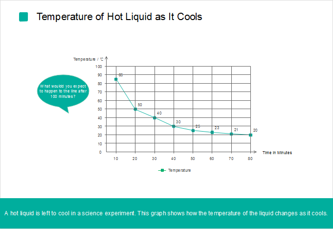
1. Experiment Statistics
Scientific invention and findings come from doing repeated experiments, recording and analyzing experiment data, deducting an assumption and then doing more experiments and verifying the data to prove the assumption. When doing an experiment, researchers usually record the detailed data results in a table rather than a line graph. As you can see, a table is not intuitive enough to show the trend. From the line graph recording experimental data below we can make an assumption that the temperature of the liquid decreases fast in the first fifty minutes, and after that, it keeps stable in about 20℃.
2. Data Changes Over Time
As what I mentioned above, a line graph features showing trends, the best use of a line graph is data that changes over time. It's easy to find that almost all graphs about product sales, grade marks and other data that changes over time are presented in line graphs - people involved in need to adjust their strategies according to the trend. The slopes between the markers allow you to judge whether the trend is about to decrease or increase.
Nevertheless, line graphs can also be applied to indicate tendencies based on other continuous periodic values, such as speed, temperature, distance etc. Just make sure the periods are equally distributed on the x-axis.
Part3: Pros and Cons of Using Line Graphs
As is known to all, every coin has two sides. Line graph also has its pros and cons.
1. Pros
- Work well in showing trends chronologically.
- Clearly display relationships with continuous periodical data.
- Visualize data changes at a glance.
2. Cons
- Matches best with periodical data.
- Mess the chart if many categories are compared in one line chart.
Part4: Skills of Using Line Graphs
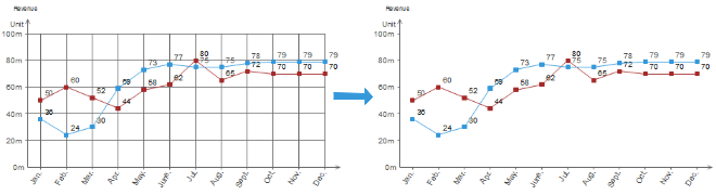
1. Hide the Grid
If you focus on the trend rather than the concrete values of each category, then hide the grid. Grids would squeeze the lines, dots and texts in a frame, making the line graph messy and crowded.
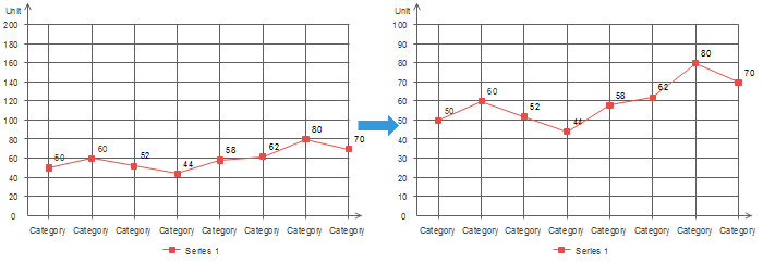
2. Change the Max Value of Y-axis According to Your Data
If there is only one category or the change over time doesn't vary obviously, you will find that the line connecting the markers looks almost flat, which is not good for analyzing the trend. In cases above, you can reduce the max value of y-axis, so that the slope goes steeper, then the trend can be seen easily.
3. Highlight the Category You Concern Most
If you are in charge of a branch company, you may compare the economy growth with branches in other regions to know your performance. In this case, use a different color or thick line to highlight the data of your branch and color other lines gray.
We can easily draw a conclusion that line graphs work out best in representing experiment statistics and data changes over time. Learn more about line graph to make better line graphs with Edraw line graph software.

An all-in-one platform for 210+ diagrams.
・ Simple alternative to Visio
・ 26k+ symbols
・ 10K+ free templates
・ 10+ AI diagram generators


Further Reading:


