When to Use an Area Chart
Overview of Area Charts
Facilitating similar analysis to line charts, area charts are mainly applied to represent data that follows a time-series relationship. The most distinct difference between line graphs and area chart is that it’s easy to see that the area below plotted lines are filled with colors. The scale of a color fill indicates the magnitude of the corresponding value. An area chart plots information on the x-axis and data values on y-axis by connecting data points with solid line segments. When the magnitude of the trend needs to be communicated, rather than individual values, area charts work best.
Try a piece of handy and versatile chart software - Edraw Max. Download it for free.
Types of Area Charts
Area Charts with Data Plots Stacked on Top of Each Other
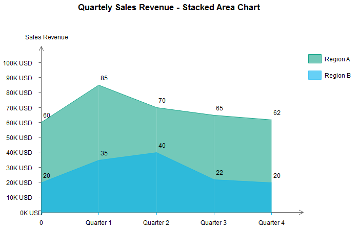
A stacked area chart is best used to show distribution of categories as parts of a whole, where the cumulative total is unimportant. In stacked area charts, arrange data to position categories with highly variable data on the top of the chart and low variability on the bottom. The chart "Quarterly Sales Revenue - Stacked Area Chart" is an example of this.
Area Charts with Data Plots Overlapping Each Other
We may call such chart an "Overlapping Area Chart". In an overlapping chart, the maker has to ensure data isn’t obscured in the background, so transparency is universally used.The folowing chart "Quarterly Sales Revenue - Overlapped Area Chart" is an example of this.
Occasions of Using Area Charts
Analyze a Part-to-whole Relationship
Different from line charts, area charts feature representing the magnitude with the scale of the corresponding color fill between the line segments and the x-axis. A stacked area chart does a fine job in establishing a part-to-whole relationship among all categories. For instance, from the stacked area as follow, you can tell easily that Region A contributes more to the total sales than other Region B.
Know the Magnitude of the Change
The filling between the line segments and the axis line facilitates understanding the magnitude, something which cannot be done using the line chart - a chart that is often argued to be better than the area chart. As is known to all, line charts work well in displaying trends and changes of a category. However, line charts are not able to signify the magnitude of the change visually. In an area chart, the filling between line segments and the axis indicates the magnitude of the change distinctly.
Compare a Few Categories
In area charts with overlapped data plots, you may find it difficult to figure out the starting point and the end of a data plot. You can blunt such a problem by adjusting colors and transparency to proper values. In this case, area charts with overlapping data plots work better than stacked data plots. It may take some time for the audience to deduce the concrete value of a specific data value, because they need to do some math calculation with the previous data plot and the total.
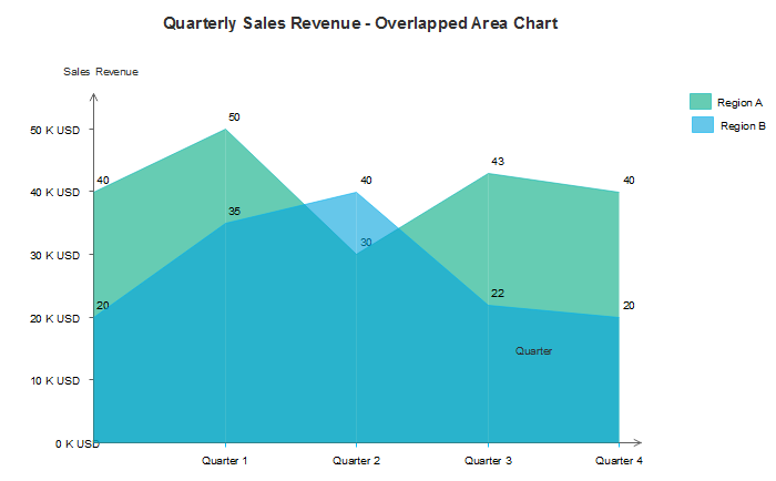
Looking at the overlapped area chart above for the first time, you see three colors and may think that there are three categories. As a matter of fact, take a closer look and you will find that this area chart showcases only two categories. The color difference due to transparency setting can sometimes be misleading. To avoid such clutter and gain better visual experience, I recommend to use line charts if multiple categories are involved.
Conclusion
This article makes an analysis on when to use area charts. From the analysis above, we can safely draw a conclusion that an area chart could be a good choice if you need to communicate the data sets or establish a part-to-whole relationship.
For more information on area charts and chart software, visit the following page for further reading :


