Area Chart
- Part 1: What is a Area Chart?
- Part 2: When Were Area Charts Invented?
- Part 3: Advantages and Disadvantages of Area Charts
- Part 4: When To Use An Area Chart?
- Part 5: Types of Area Charts
- Part 6: Create an Area Chart with Excel
- Part 7: Creat an Area Chart with EdrawMax
- Part 8: Examples of Area Charts
- Part 9: Conclusion
Part 1: What is a Area Chart?
If you are a business manager and want to know how well your products are doing, a wise way would be to draw an area chart for their sales and performance. But what exactly is an area chart?
Also known as the area graph, area charts are an extension of the line charts that helps in representing the quantitative data. It provides a visual representation of the statistics and the change in them over time. For easy comparison between two quantities, the area between the axis and the line is filled and emphasized with textures and hatchings.

Part 2: When Were Area Charts Invented?
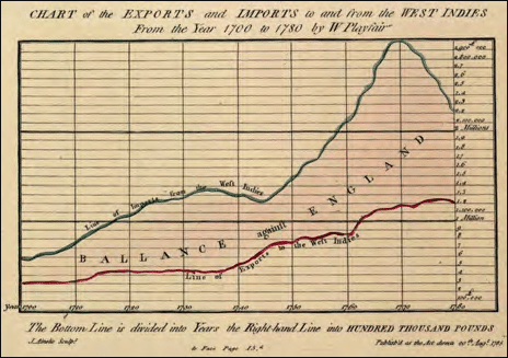
Talking about their history, area charts were invented by a Scottish engineer and political activist, William Playfair. In 1786 he published a book, The Commercial and Political Atlas, that contained several time-series graphs, including the area chart. He is also credited with inventing the pie charts, line graphs, and bar charts.
Part 3: Advantages and Disadvantages of Area Charts
Area Charts are very versatile and can be used when comparing two or more quantities quantitatively. It helps represent the data cumulatively and follow their trends. However, as useful as they seem, they have their limitations. Let’s have a look at both of them.
Advantages
- A helpful tool for comparing two or more quantities.
- Data is simple to follow and understand.
- Great for showing trends over time and analyzing the statistics.
Disadvantages
- Following and understanding the trends is easy, but exact values can not be compared.
- Ineffective when comparing large groups of data. The data plots are overlapped, and it becomes difficult to make out where they end or start.
Part 4: When To Use An Area Chart?
Area charts are a simple yet quick way of comparing and analyzing data. They are used to communicate the overall trend of progress for a product, an item, or a person. Let’s see some areas where area charts can be a good choice.
1) Analyzing The Yearly Sales
For businesses, this is a focal use of area charts. The data can be plotted for a few top trending or the least trending products and compared for an overview. This helps the company analyze which items are a popular choice and profitable while which one needs improvement or should be removed from the product range.
The data is plotted monthly, in a trimester, or yearly for a better analysis. Trends help in assessing the profits and sales for the year.
2) Gauging the Performance of an Employee/Student
Performance checking is another area where area graphs are of great use. Data like assessment marks, punctuality, teamwork are collected and plotted on a graph. This helps in gauging who performed the best and who lacked behind. Plotting data for a certain period helps in assessing the improvements developed over time. A particular employee/student can be compared with another colleague or the whole team.
3) Know the Magnitude of a Change
This is a general but important use of the area graphs. They can be drawn when there is a significantly large difference between the values and help analyze the magnitude of change. It also facilitates highlighting the specific action that led to an improvement or deterioration of an item.
4) For A Simple Comparison
Since area charts are more about visual representation than numbers, they are an effective tool when comparing two or more quantities. The colors and lines help in following trends and see who outperformed whom.
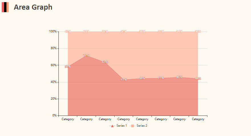
Part 5: Types of Area Charts
Area charts are divided into two types, depending on the purpose of use. Based on the comparison, which may be group comparison or complete evaluation, they types are:
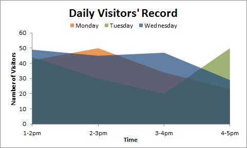
1) Overlapping Area Chart
If we want to compare two groups of data, an overlapping Area chart is drawn. The colored segments overlap each other and provide a clear overview of both groups. Transparency is included in the shading, so the data remains visible.
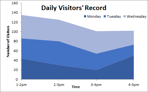
2) Stacked Area Chart
This area chart visualizes the data plots, so they appear as the extension of the previous data group. The data plots are stacked on each other and are distinguishable due to color differences. The topmost line will always represent the total when summing all the groups. Stacked area charts are useful when you are trying to compare all the features of a specific item.
Part 6: Create an Area Chart with Excel
Even though the tools are limited, Microsoft Excel can help create minimalist yet productive charts in no time at all. Follow these simple steps to create an area chart on Microsoft Excel.
- Open Microsoft Excel on your PC.
- Insert your data in the table or open a pre-made file to start creating. For opening the file, click on the File tab in the upper left corner. Next, click the Open tab. A dialogue box will appear. Select your file and click Open.
- After inserting the data select the data range for the area chart using the cursor.
- Click Insert, followed by a click on the Area tab in the Chart section. Select the type of chart: 2-D or 3-D. The selected chart type will appear on the screen for the selected date range.
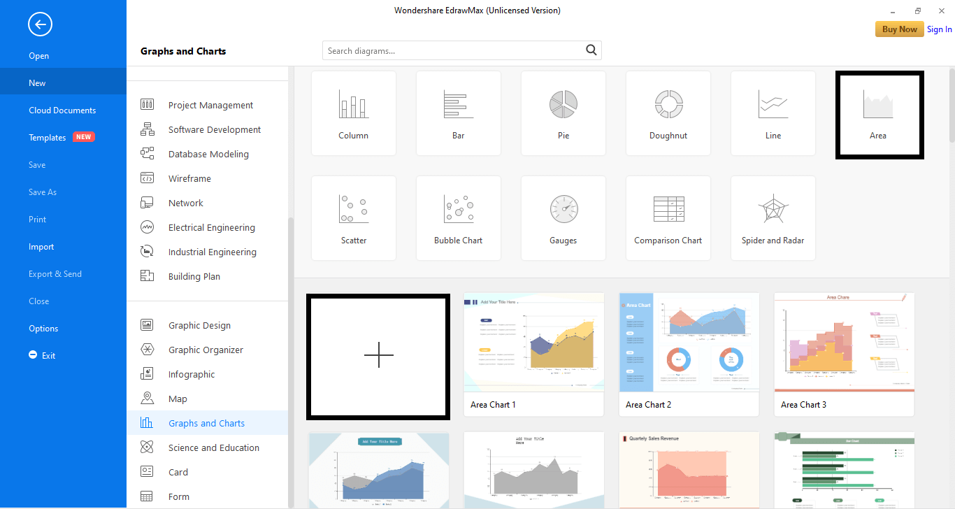
Part 7: Creat an Area Chart with EdrawMax
Designing and creating an area chart with EdrawMax is a piece of cake. With the wide variety of tools and these easy steps to follow, create your area charts in a wink of an eye.
Step 1: Download and load the EdrawMax software on your PC.
Step 2: In the left column, go to the New tab and select the Graphs and Charts tab from the menu.
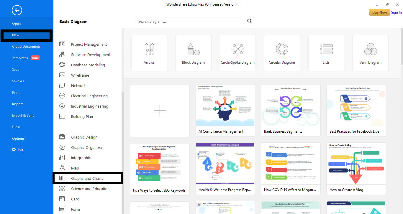
Step 3: Next, select the Area tab. A range of templates will appear. Select a pre-made template or start from scratch by clicking the plus-shaped icon. (+).
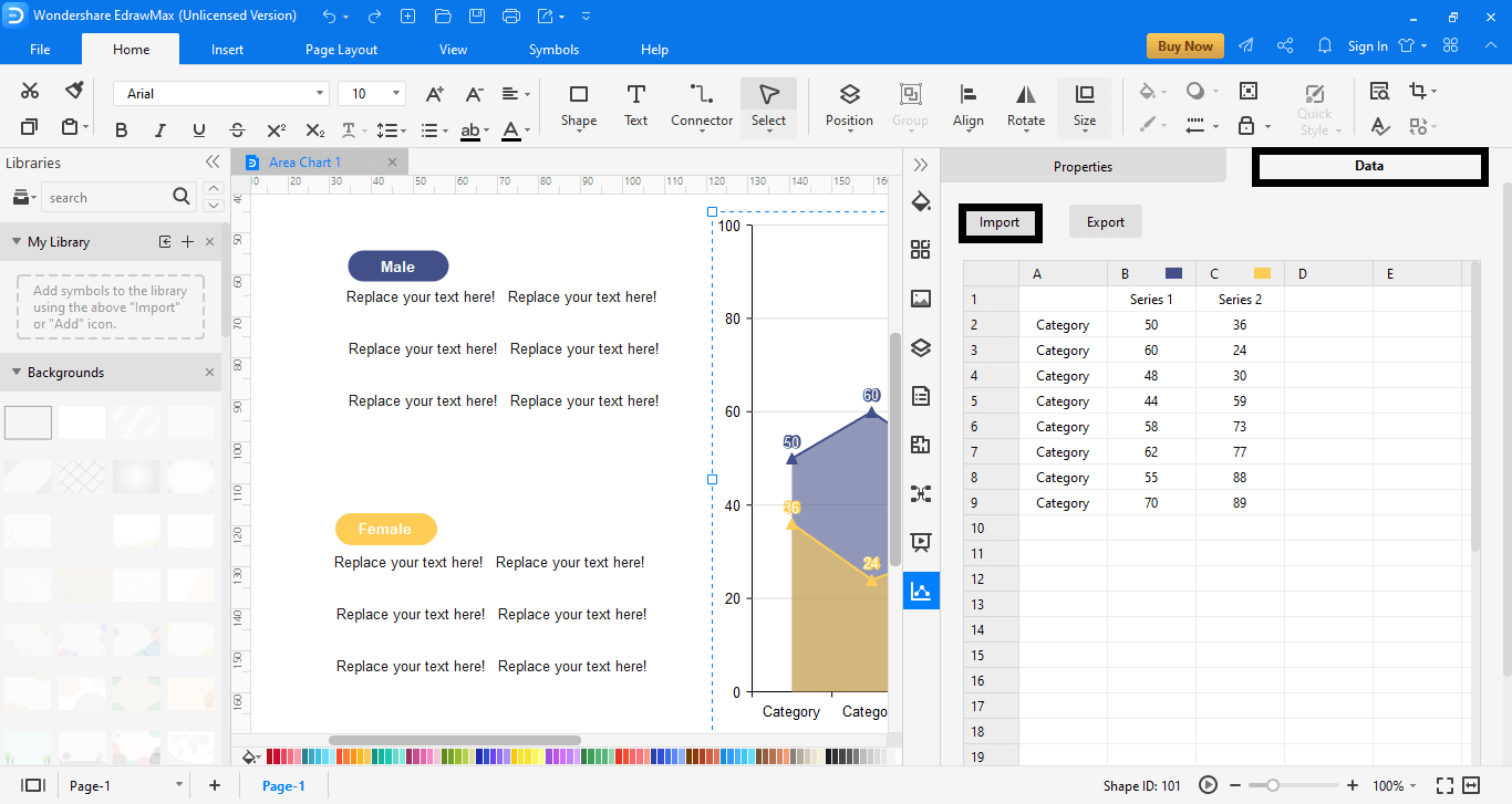
Step 4: A new window will appear. Here, insert the data for your chart. Select the Data tab and replace the text with your values. You can also import data from an Excel file by clicking the Import tab.
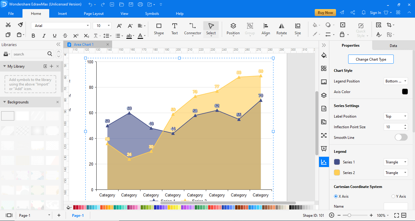
Step 5: Next, edit and design your area chart with the available tools.

An all-in-one platform for 210+ diagrams.
・ Simple alternative to Visio
・ 26k+ symbols
・ 10K+ free templates
・ 10+ AI diagram generators


Part 8: Examples of Area Charts
Edraw has a variety of area chart templates to offer. Let’s have a look at some of them.
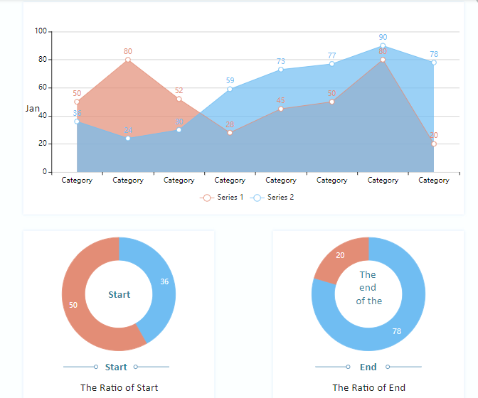
Area Chart with Ratio
This is a template from the Edraw template gallery. This area chart helps compare the sales, marketing, or progress of a certain product throughout a month. While the red area shows product 1, blue product 2, the darker blue area shows the combined progress of the two products. The Area Chart 2 template also helps in analyzing the stats via pie charts. One of them represents the initial progress while the other emphasizes the end performance of the two products.
Sales Revenue Stacked Area Chart
Sales Revenue Area chart is another visionary template offer by Edraw. This is a useful template, especially for people concerned with the performance of their products in different locations. Unlike the previous template, this one does not overlap the data plots and provides two separate graphs lying parallel as an extension of the previous data for easy comparison. Instead of focusing on different aspects of a product, it deals with their sales in two different regions.
Part 9: Conclusion
It’s a wrap! By the end of this article, you will probably know how and why area charts are a great choice for competitive analysis. With a wide range of tools and templates at Edraw, express your creativity and design your area charts.


